| Image |
Comment |
| 01/02/2007 05:43:56 PM |
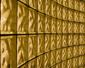
Blocks & Curvesby ThorloComment: This is a pretty fun pattern. I think it would look better rotated 90degrees counter clock wise. Maybe also a bit more push on the colour... not much just a touch. |
 Photographer found comment helpful. Photographer found comment helpful. |
| 01/02/2007 05:40:47 PM |
The Light Bendsby zifengwComment: This is a nice idea. however, the lack of sharper focus away from the great bright ball in sky is a let down. I would have liked to see focusin a different area. |
| Photographer found comment helpful. |
| 01/02/2007 05:39:38 PM |
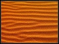
Wind Blownby BlackboxComment: I really like this image for some bizzar reason. I think it works rather well. |
| Photographer found comment helpful. |
| 01/02/2007 05:35:27 PM |
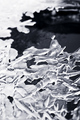
Frozen Asymmetryby pidgeComment: Nice image. however, I feel the dark right side stands out much much better than the blown out left. Also the dof is ruff on my eyes here. |
| Photographer found comment helpful. |
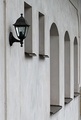
| 01/02/2007 05:33:57 PM |
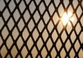
Windows and Lanternby Blink_Too_FastComment: If There were two more smaller windows I would buy it. The image is a nice image overall. Just a few distracting elements like the bottom right corner. I would also liked to see a bit more contrast to it maybe. |
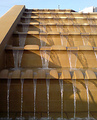
| 01/02/2007 05:32:28 PM |
Patterns in water and shadowby mistComment: Interesting idea. Personaly I would have liked to see a tighter crop to not show anything outside the fountain. Also, it appears to have a neat image feel and usm that just doesn't work for me. But it is a very creative Idea. Also the shadow of the side wall into the fountain distracts. Think of what this would look like at a differnt time of day with the shadows of the water and no others... |
| Photographer found comment helpful. |
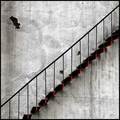
| 01/02/2007 05:29:01 PM |
flightby hopperComment: Simple, elegant, but for me personaly I would have liked a more dramatic angle. |
| Photographer found comment helpful. |
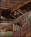
| 01/02/2007 05:27:14 PM |
Divine proportionby RulerZigzagComment: Very interesting image. I think you found one of the better patterns of the challenge. It seems most elements workign rather well together. Nice job. |
| Photographer found comment helpful. |
| 01/02/2007 05:26:15 PM |
The Dance: Dark & Lightby 777STANComment: Fairly creative concept here. for me though, I would like to see the light higher and not layered with the posts. |
| Photographer found comment helpful. |
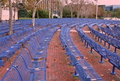
| 01/02/2007 03:30:04 PM |
Feeling Blueby groot3909Comment: I feel the white balance is off and the colours could use a little push. Its a nice idea all the same. The curve of the seats really gives you a spacial element. |
Home -
Challenges -
Community -
League -
Photos -
Cameras -
Lenses -
Learn -
Help -
Terms of Use -
Privacy -
Top ^
DPChallenge, and website content and design, Copyright © 2001-2026 Challenging Technologies, LLC.
All digital photo copyrights belong to the photographers and may not be used without permission.
Current Server Time: 07/23/2026 03:28:25 PM EDT.