| Image |
Comment |
| 05/12/2004 12:07:58 AM |
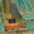
End of the lineby BrennanOBComment: Originally posted by omnibus:
Nice capture, looks very slightly tilted (looking at the lettering at the lower left). Just out of curiosity, is the whole boxcar rusted, or is it just faded boxcar red? |
The whole thing is just about to break out in rust if it dosen't get help soon, so whil the paint is an oxidized brownish red, anything that sticks out is rusted as well as any scratch or belmish. Sadly it didn't reduce very well, decent print but when I posted it I realised that it lost alot in transition. As to the tilting, I agree and have rotated it a touch.
Brennan |
| 05/08/2004 05:34:42 PM |
Rusty Hydrantby chanComment: the tilted frame is distracting and hurts the composition. good colors and on the whole quite good. |
| 05/05/2004 01:38:28 AM |
|
 Photographer found comment helpful. Photographer found comment helpful. |
| 05/04/2004 03:30:10 PM |
|
| 05/04/2004 03:26:57 PM |
Perfect proportionsby johnmComment: Stong photo, but not too well tied to the challenge. You will loose points on applicability, not on other issues. I wish you could have gotten your reflection minimised , but even so the reflections make the shot. |
| Photographer found comment helpful. |
| 05/04/2004 03:18:51 PM |
|
| Photographer found comment helpful. |
| 05/04/2004 03:12:21 PM |
|
| Photographer found comment helpful. |
| 05/04/2004 03:10:49 PM |
not quite the right proportionby bruskiComment: I wish the bottom of the pitcher was in the photo, It would make a strong composition stronger. There is alot of white in the upper left, either re shoot or crop to match more closely. |
| Photographer found comment helpful. |
| 05/04/2004 03:08:10 PM |
Quizzicalby JeanComment: Stong photo, but not too well tied to the challenge. You will loose points on applicability, not on other issues. |
| Photographer found comment helpful. |
| 05/04/2004 03:05:45 PM |
Reflection Twoby michaelkComment: great image but I wish it was bigger so I could see it better. what I can see is strong, but it is half the size of the better images. |
| Photographer found comment helpful. |
Home -
Challenges -
Community -
League -
Photos -
Cameras -
Lenses -
Learn -
Help -
Terms of Use -
Privacy -
Top ^
DPChallenge, and website content and design, Copyright © 2001-2026 Challenging Technologies, LLC.
All digital photo copyrights belong to the photographers and may not be used without permission.
Current Server Time: 06/26/2026 01:30:04 PM EDT.