| Image |
Comment |
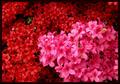
| 05/13/2004 11:49:19 PM |
Spring Flowersby MobiusComment: rich and dense. nice job filling the picture frame. i find the border a bit much however |
 Photographer found comment helpful. Photographer found comment helpful. |
| 05/13/2004 11:47:44 PM |
In the Gymby magnusComment: very nice colors. the tie between her hair the earings and the weight bar make the shot. i think a hair light in the upper right corner would haave helped, as it is her head looks very slightly asymetric. |
| Photographer found comment helpful. |
| 05/13/2004 11:41:25 PM |
Babyby JackoComment: new and a fresh perspective, great capture, a bit of bounce light on the left would have helped but still the best of the bunch thus far. 9 |
| Photographer found comment helpful. |
| 05/13/2004 03:58:28 PM |
OldCurves, NewLinesby banmornComment: lovely. the way the recessed coffers in the dome echo the rectanglar windows in the office building behind makes this work. Good colors, fine composition, good use of the thirds without letting it rule your layout. |
| Photographer found comment helpful. |
| 05/13/2004 01:06:54 PM |
Old and Newby KonadorComment: Strong composition, a bit overmanipulated in the color saturation for my taste though. Best in the floral arrangment as symbol group. great DOF 8 |
| Photographer found comment helpful. |
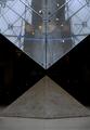
| 05/13/2004 01:05:37 PM |
Up and downby GabrielComment: I like this shot quite a bit, being an IM Pei fan, but I wish the edges of the lower pyramid were visible and just a bit brighter. If you could bouced a bit of flash onto the stone with out picking up the reflection in the hanging glass, you could have brightened it and dimished the lights from the shops in the backround. All that being said great composition and subject, nailed the challenge, top ten. I have a silly picture with my eight year old daughter with her head between the two points from when we were there a few years past, thanks for the reminder, Ill have to dig it up. |
| Photographer found comment helpful. |
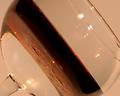
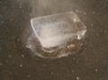
| 05/13/2004 12:54:42 PM |
Oil & Waterby cbellerComment: I wish you had hit the oil with more light to really make it glow, either from behind or above to keep highlights off the glass. The composition is interesting but the colors need to be as bold as your framing. |
| Photographer found comment helpful. |
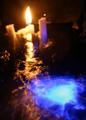
| 05/13/2004 12:50:05 PM |
Fire Waterby duncesComment: Looked great as a thumbnail, but it is too small and I can't see anything in focus. Great colors and framing, setting up a nice duality, but make it bigger next round, belive me it will help. |
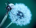
| 05/13/2004 12:31:13 PM |
sublimationby DoylieComment: I wish there were more color here, mabey a flash light with a bit of colored plastic over the end would have really brought some needed definition to the dropletr and the steam. I really like the idea, it could have been sublime with stronger lighing. |
| Photographer found comment helpful. |
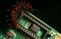
| 05/13/2004 12:27:19 PM |
Nature and Technologyby bledfordComment: Nice colors, composition and concept, but if you are going to go for a studio still life (sort of still anyway) and you don't nail the focus across a solid DOF it will cost you points. Other than the focus and the extranious gold triangle leading the eye off the lower right corner, a very nice shot. |
| Photographer found comment helpful. |
Home -
Challenges -
Community -
League -
Photos -
Cameras -
Lenses -
Learn -
Help -
Terms of Use -
Privacy -
Top ^
DPChallenge, and website content and design, Copyright © 2001-2026 Challenging Technologies, LLC.
All digital photo copyrights belong to the photographers and may not be used without permission.
Current Server Time: 06/26/2026 03:14:49 PM EDT.