| Image |
Comment |
| 09/12/2005 02:18:09 PM |
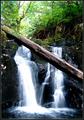
Fallsby madhatterComment: Lovely shot, my only improvment might be a bit of burning at the top edge to keep the eye from wandering off the top of the page. Lovely color and tones. Of course it will probably get hammered since the subject is not a head and sholders shot with one hand supporting the chin, but it is a lovely photograph |
 Photographer found comment helpful. Photographer found comment helpful. |
| 09/12/2005 02:11:16 PM |
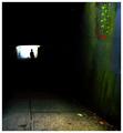
Confessionby pitsamanComment: amazing light! In the thunbnail I thought it was a Vermeer painting. i think it would have been dunned in the challenge for not being a classic head and sholders portrait, bit it is a lovely work of art. |
| Photographer found comment helpful. |
| 09/12/2005 01:06:31 AM |
Solitaryby JPRComment: great moody shot with lucious color. the brnach may be too minor an element to do too well in this competition, but the shot is very nice. |
| Photographer found comment helpful. |
| 09/12/2005 12:58:21 AM |
|
| Photographer found comment helpful. |
| 09/11/2005 11:50:18 PM |
Rippled Reflection.by timmeriowaComment: great shoy but way too small, bigger is brighter and better. this shot is nice, and I want to see more. 640 pix on the long axis is what this deserves. |
| Photographer found comment helpful. |
| 09/11/2005 03:51:50 AM |
|
| 09/08/2005 11:18:35 PM |
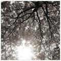
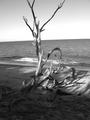
Reach for the Skyby MattBComment: best so far, great forms and tones, My only complaint is that the branches blend into the dark band of backround (Mountains?) minor quibble with a very nice shot. |
| Photographer found comment helpful. |
| 09/08/2005 11:13:47 PM |
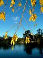
Kowhai, Virginia Lake, Wanganuiby kiwinickComment: nice use of fill flash, I like the contrast in colors and tones it sets up. the placment of the horizon line relative to the branch seems rather random. |
| Photographer found comment helpful. |
| 09/08/2005 11:11:39 PM |
|
| 09/08/2005 01:46:37 PM |
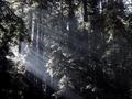
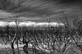
Wild Woodby jrjrComment: AAch. the dreaded tilted horizon! I have been crushed for this same flaw so you have my sympathy. To my mind a greater eror is it looks like this was edited to print rather than for the screen where the tonal range is too narrow to show off all the dark tones in the shadows. If you had dodged out some more detail it would have scored better. I like the Westonesque vibe, of course he would have closed in on one element, but the feel is similar
|
| Photographer found comment helpful. |
Home -
Challenges -
Community -
League -
Photos -
Cameras -
Lenses -
Learn -
Help -
Terms of Use -
Privacy -
Top ^
DPChallenge, and website content and design, Copyright © 2001-2026 Challenging Technologies, LLC.
All digital photo copyrights belong to the photographers and may not be used without permission.
Current Server Time: 07/19/2026 06:11:12 AM EDT.