| Image |
Comment |
| 03/12/2006 04:52:46 PM |
|
 Photographer found comment helpful. Photographer found comment helpful. |
| 03/12/2006 04:48:27 PM |
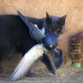
Caught!by RistyzComment: good capture, very well processed, At first I didn't like the pipe line on the right edge, but it does give some balance and greater sense of place. The expression in the cat's eyes and the perfect framing of the bird's wings and feet pointing to the corners of the frame make this a top ribbon contender. |
| Photographer found comment helpful. |
| 03/12/2006 04:44:28 PM |
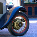
The Great Gatsbyby Rae-AnnComment: on my screen the cyans seem to be oversaturated and the blusih cast is too dominant. I like the sweep of the fender and the texture of the road, but the dense well focused stuff above the brick wall in the upper right of the frame is distracting and doesn't help your composition. |
| Photographer found comment helpful. |
| 03/12/2006 04:41:15 PM |
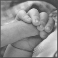
A hand that will lead his futureby DiComment: Nice composition and a sweet sentiment. I wish you had a darker black somewhere, the highlihgts are well done, but the darkest tones seem to be a middle grey, and the flatness steals some of the drama from this shot. |
| Photographer found comment helpful. |
| 03/12/2006 04:36:58 PM |
Simple Lifeby whiteroomComment: I like the way the road takes the eye up and through the frame, and the placment of the people on that line, but the focal softness throughout the frame is unfortunate. |
| Photographer found comment helpful. |
| 03/12/2006 04:34:39 PM |
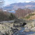
The Little Bridgeby barbaraanneComment: I can see by the trees that this scene is correctly rotated, but the mountains, the bay and the road all slope off to the right and make the scene vaguely disorientating |
| Photographer found comment helpful. |
| 03/11/2006 01:39:19 PM |
Colored Reflection IIby RikkiComment: Nice shot and a very creative and purposefull de-sat. However I wish there was more contrast in the B&W half between the roofline and the sky, especially in the clerestory over the entry doors: the contrast is there in the color version, but the hues de-sat too close to one another. |
| Photographer found comment helpful. |
| 03/09/2006 07:17:57 PM |
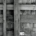
Squared offby DeiganComment: lokks loike a bit too much USM, or some thing has put quite a few artifacts on this shot. |
| Photographer found comment helpful. |
| 03/09/2006 07:15:00 PM |
|
| Photographer found comment helpful. |
| 02/24/2006 12:15:23 PM |
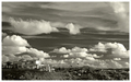
Elevated Lifestyleby BradComment: I wish the sbject on the ground had the same interest as the lovely sky. everything seems so far away in this limited 640 pixel frame, I wish for some foreground interest. Lovely tones, you got everything out of this shot in post processing. |
| Photographer found comment helpful. |
Home -
Challenges -
Community -
League -
Photos -
Cameras -
Lenses -
Learn -
Help -
Terms of Use -
Privacy -
Top ^
DPChallenge, and website content and design, Copyright © 2001-2026 Challenging Technologies, LLC.
All digital photo copyrights belong to the photographers and may not be used without permission.
Current Server Time: 07/22/2026 10:42:06 AM EDT.