| Author | Thread |
Comments Made During the Challenge  |
|
|
03/10/2006 01:35:12 PM |
|
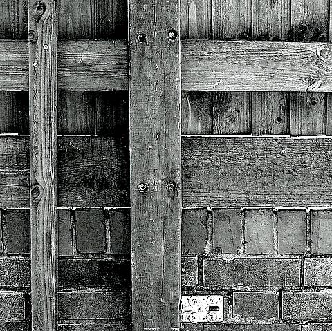
would have gone higher, but it looks like it was oversharpened or something that cut some of the finer detail from the white box and nails/bolts. |
|
 Photographer found comment helpful. Photographer found comment helpful. |
|
|
03/10/2006 05:25:28 AM |
|
I like the noisy textures. Nice composition too. |
|
| Photographer found comment helpful. |
|
|
03/09/2006 07:17:57 PM |
|
lokks loike a bit too much USM, or some thing has put quite a few artifacts on this shot. |
|
| Photographer found comment helpful. |
|
|
03/09/2006 03:58:58 PM |
|
| Photographer found comment helpful. |
|
|
03/09/2006 11:20:10 AM |
|
A little overshaprened methinks. |
|
| Photographer found comment helpful. |
|
|
03/09/2006 07:42:51 AM |
|
nice texture, I like the simplicity. |
|
| Photographer found comment helpful. |
|
|
03/07/2006 02:08:09 PM |
|
| Photographer found comment helpful. |
|
|
03/07/2006 01:37:50 PM |
480x479. NOT SQUARE. NOT SQUARE.
just kidding, close enough. I like this. Simple. Well done. |
|
| Photographer found comment helpful. |
|
|
03/06/2006 11:39:33 PM |
|
Great subject and composition, but I recommend easing off on the sharpening. |
|
| Photographer found comment helpful. |
|
|
03/06/2006 09:00:16 AM |
|
This photo seems well balanced enough for the challenge, but 70% of the tonal range is at medium gray all the way to black. It lacks a certain appeal without something prominent running through the photo that is lighter than the rest. |
|
| Photographer found comment helpful. |
Home -
Challenges -
Community -
League -
Photos -
Cameras -
Lenses -
Learn -
Help -
Terms of Use -
Privacy -
Top ^
DPChallenge, and website content and design, Copyright © 2001-2026 Challenging Technologies, LLC.
All digital photo copyrights belong to the photographers and may not be used without permission.
Current Server Time: 06/28/2026 04:59:19 PM EDT.