| Image |
Comment |
| 09/12/2005 08:31:24 AM |
Eyesby rjhodderComment: I like the mysterious sense of this shot. Her eyes are stunning and not overly post edited. I think the white light to the right is a tad blown out (for my taste at least). I wish the scarf were a solid color. The touch of pinkish red and yellow detract just a bit. Her complexion is very pretty. |
 Photographer found comment helpful. Photographer found comment helpful. |
| 09/12/2005 08:29:02 AM |
Dainty Gem by SonifoComment: I like this alot. Her placement in the shot is well done. The complimentary colors of her ballet gown against the similar colors of the textured walls adds to the softness of her. I wish I could see her face closer and study the details. The skin seems just a smidge overprocessed although the coloration is nice. I know software such as Neat Image can almost plasticize skin sometimes. The leaves on the ground add a very nice natural sense to it all. Overall - REALLY GOOD. |
| Photographer found comment helpful. |
| 09/12/2005 08:26:36 AM |
What's Up?by TallblokeComment: This struck me from the moment I saw it. The fur lined hood is a wonderful frame to the face. I wish the overall size of the subject were larger so I could really study the details of the face. Lovely eyes and beautiful creamy complexion. I like the expression of gazing out and possibly daydreaming. Nice indeed. |
| Photographer found comment helpful. |
| 09/12/2005 08:24:46 AM |
In light of historyby BrinComment: I like this very much. It is striking and not the "typical" portrait. The lighting is wonderful and helps add to the drama of his countenance. I love the beard and craggy face. Your use of negative space helps showcase his features. I wish it were a bit tighter zoom, as I'd like to really study all of the textures of his skin. Well done. |
| Photographer found comment helpful. |
| 09/12/2005 08:23:05 AM |
Baby's first Portraitby Photogirl_in_VancouverComment: Of all the baby shots, this is the only one that is a true portrait in my eyes. I just love that adorable face. The skintones are very natural, the lighting is nice and it isn't over processed. If possible, I'd have removed the blanket on the left side, but understandably, that might not be possible. Very sweet indeed. Congratulations to the parents!!! |
| Photographer found comment helpful. |
| 09/12/2005 08:17:28 AM |
A Face from Indonesiaby tyt2000Comment: I like the real sense that this has without overprocessing and "perfect" smooth skin. She has an intensityh that I appreciate. I like the off center placement in the shot as well. I wish she were wearing a different color other than pink, but that's just my personal taste. Blue would have worked nicely with the yellowish cast to her skin. Nicely done. |
| Photographer found comment helpful. |
| 09/12/2005 08:15:57 AM |
Attitudeby shutterflyComment: I like the sideways glance and the nice luminescence on her face. The hair coming off to the side as if windblown is a nice effect. I detect a slight bit of red in the eye on the viewer's left and might clone that out. Does she have an eye stud? Since you can't see the entire thing, that tiny speck of white is just a touch distracting. I like the crop that you did and the frame sets it off nicely. |
| Photographer found comment helpful. |
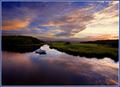
| 09/12/2005 02:16:15 AM |
Summer's End — Sunriseby Bear_MusicComment: Awesome job, my friend. One of the few 10's I doled out and it was richly deserved. When you're rich and famous I can say "I knew that guy." (well, sort of) LOL
Congrats on a great finish!!! |
| Photographer found comment helpful. |
| 09/12/2005 01:56:31 AM |
|
| Photographer found comment helpful. |
| 09/12/2005 01:48:13 AM |
Innocenceby JudiComment: This is well done. I like the lighting. Her eyes are clear as a bell. The hair in the face is a nice touch. I might've cloned out the saliva in the corners of her mouth but otherwise, nicely executed. |
| Photographer found comment helpful. |
Home -
Challenges -
Community -
League -
Photos -
Cameras -
Lenses -
Learn -
Help -
Terms of Use -
Privacy -
Top ^
DPChallenge, and website content and design, Copyright © 2001-2026 Challenging Technologies, LLC.
All digital photo copyrights belong to the photographers and may not be used without permission.
Current Server Time: 06/20/2026 06:41:24 AM EDT.