| Image |
Comment |
| 09/21/2005 10:53:48 AM |
Bike Yardby fluxnComment: LOL I love the one in the tree. Maybe a touch snap shot feeling, but it has sort of an urban grunge sense which I like. I like really high contrast for this type of shot. |
| 09/21/2005 10:53:07 AM |
The hatby militarygirl10Comment: Great portrait. I love the detail of his beard and eyes. Excellent expression. The DOF is really good and I like the hat very much. |
 Photographer found comment helpful. Photographer found comment helpful. |
| 09/21/2005 10:52:32 AM |
|
| Photographer found comment helpful. |
| 09/21/2005 10:50:58 AM |
Somnolent Tranquilityby cycomerlin14Comment: I like the title. Interesting use of color and light - I like it's softness. Maybe a touch harsh but the overall effect is quite nice. |
| Photographer found comment helpful. |
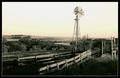
| 09/21/2005 09:48:46 AM |
Nebraska Windmillby jmosherComment: Love the rural sense of this. The diminished colors really work well. You might up the contrast a hair. Overall - very nice and suits the challenge perfectly. |
| Photographer found comment helpful. |
| 09/21/2005 09:48:11 AM |
WADING FOR MISS PIGGIEby DustyComment: HEE HEE - clever title. I love his face. The murky bottom isn't very appealing, but HEH - it's a frog. In a perfect set up, he'd be on a lilly pad with sparkling water. ;~) |
| Photographer found comment helpful. |
| 09/21/2005 09:47:21 AM |
Minuetby banmornComment: I love the title. I sense a tad bit of focus problems . That's disappointing because I love the black background and the light. The colors are beautiful too. 7 |
| Photographer found comment helpful. |
| 09/21/2005 09:45:52 AM |
Ever Awareby TommyMoe21Comment: Lovely capture. I like his far off gaze. Good clarity and focus. His placement in the shot is as if you picked him up and put him there. This would work as a study in black and white too. I think there is enough contrast of tones to carry it off. Just a thought. Nicely done. |
| Photographer found comment helpful. |
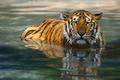
| 09/21/2005 09:44:44 AM |
Fearlessby xylkeComment: Great shot. I love it that tigers are the only big cat that enjoys swimming. The movement of the water and coloration against the golden hues of his fur is a nice contrast. I like the reflection as well. I wish his eyes a a touch of sparkle in them. |
| Photographer found comment helpful. |
| 09/21/2005 09:43:36 AM |
moo...by BethanComment: HEE HEE - perfect composition but the colors are a bit washed out and the focus could use a bit of work as well. This might be a good study in black and white with tack sharp focus - you'd really have something then. |
| Photographer found comment helpful. |
Home -
Challenges -
Community -
League -
Photos -
Cameras -
Lenses -
Learn -
Help -
Terms of Use -
Privacy -
Top ^
DPChallenge, and website content and design, Copyright © 2001-2026 Challenging Technologies, LLC.
All digital photo copyrights belong to the photographers and may not be used without permission.
Current Server Time: 06/21/2026 08:39:22 PM EDT.


![my d50 is here! (And my point of interest [d50] is placed on the intersection of the lines :D](https://images.dpchallenge.com/images_challenge/0-999/380/120/Copyrighted_Image_Reuse_Prohibited_233915.jpg)