| Image |
Comment |
| 11/30/2005 08:39:02 AM |
Mass Producing Mindsby balancedfoxComment: Love the lighting and the use of black and white. The repetition of the desks works. I like the diagonal sense of it as well. Sometimes the monotony of things creates the WOW factor and this is a perfect example. 8 |
 Photographer found comment helpful. Photographer found comment helpful. |
| 11/30/2005 08:38:00 AM |
The Thamesby melalouiseComment: I like the dead center approach you chose. The leading line of the bridge really works. Nicely done. 8 |
| 11/30/2005 08:37:32 AM |
Samoa Pulp Mill by bryanbrazilComment: AWESOME!! The smoke/steam looks like velvet. The lighting is beautiful. I love the reflective quality of this shot as well. Good job. 9 |
| Photographer found comment helpful. |
| 11/30/2005 08:36:42 AM |
Classicby tjmuellerComment: I like the leading line. Great symmetry. This would look cool in sepia or black and white as well, for a fun variation. 7 |
| Photographer found comment helpful. |
| 11/30/2005 08:35:56 AM |
Beauty of the Beastby ibkcComment: I love the movement of the steam/smoke. The blur of the lights on the water helps add to the shot. I'd do a bit of saturation work to really up the sky and wate tonesr. |
| Photographer found comment helpful. |
| 11/30/2005 08:35:07 AM |
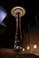
|
| Photographer found comment helpful. |
| 11/30/2005 08:34:40 AM |
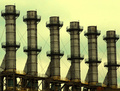
Stacksby drake217Comment: Oh I love this. The visual with the perfect symmetry including the diagonal sense is very interesting to the eye. I like the bronze coloration of the stacks with the pale aqua of the sky. That hint of golden orange of the railings (scaffolding?) realy helps too. This is great. 9 |
| 11/30/2005 08:33:36 AM |
Patternsby codauberComment: I like the simplicity of this. I wonder if you did single color adjustments of both black and neutral and brought up the black - it would create more contrast, but wouldn't make the white any whiter. Hmmm - just a thought. |
| Photographer found comment helpful. |
| 11/30/2005 08:31:51 AM |
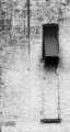
the buck stops hereby dewedComment: Interesting. I like interjecting the human form into this challenge of buildings and smoke stacks. The lighting is great. I think (to be nit picky) a well tanned or sleeved arm might've conveyed the message even further. But having said that, the lighting is awesome, and the use of negative space helps give this impact. The movement of pulling on the right glove helps bring the message home. I like the title too~~ Well done. 9 |
| Photographer found comment helpful. |
| 11/30/2005 08:29:12 AM |
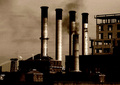
Exhaustedby dig-itComment: This isn't that unusual, but what makes it work for me is the filtration. It reminds me of an old postcard from an earlier time. I like the black of the smoke mixed with the white of the steam rising up out of the smaller stacks. The horizontal sense of the four main stacks is interesting to the eye and the crop gives you a sense that you are seeing everything, yet it's not panned back too far. Well done. 8 |
| Photographer found comment helpful. |
Home -
Challenges -
Community -
League -
Photos -
Cameras -
Lenses -
Learn -
Help -
Terms of Use -
Privacy -
Top ^
DPChallenge, and website content and design, Copyright © 2001-2026 Challenging Technologies, LLC.
All digital photo copyrights belong to the photographers and may not be used without permission.
Current Server Time: 07/29/2026 11:03:10 PM EDT.