A big hello from the Critique Club!
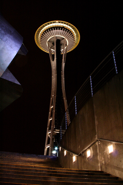
My initial reaction to this image is favorable, but the sculpture on the upper left of the image is very distracting - basic rule: if it does not add to the composition, remove it. The leading lines of the raling and fencing is nice, but the very centered needle is rather unexciting. I don't like the steps at all, or how the wall intersects the center of th ebase of the Needle. If you had moved a bit farther left (if even possible) then that might have fixed all these issues, place the needle on the left third of the image and had more overall impact. Perhapd moving closer by a few steps and shooting lower, laying down even, might have gotten the right angle.
It is very good that you have something besides the needle itelf in the image. I like the blue on the fence object, and althought the sculpture thingy is similar in color, it does distract. Freed of any editing restriction, perhaps making the stair lights blue would be a nice balance to the fence color.
Technically this is well exposed, in focus and sharp. Not much to say here beyond that.
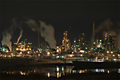
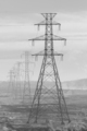
Connection to the challenge is weak. To me the Needle is architecture, icon, landmark, restaurant, tourist attraction - not industrial at all. I did not vote on your image, but I might have marked it down a point for the weak connection. Still, 5.4 is above average so the voters did not have too many issues with the image. Night shots generally do well here (see my landscape entry and alansfreed 's entry. he got 11, i got 82 with the same subject, but his was at night! His top shots are night shots.)
Welcome to DPC, glad to have you here (we canon users need to stick togehter these days - too many pretender dSLRs out there LOL).
-chris
Message edited by author 2005-12-11 01:00:38. |