| Author | Thread |
|
|
12/13/2005 06:08:25 PM |
*Critique Club*
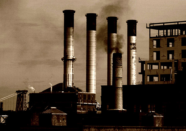
You mention in the Photographers Comments that you "was hoping to capture a more intensed smoke from the stacks", what could be better than black smoke for the idustrial challenge? I like the sepia tone that you chose...couldn't have been a better choice. The only thing that bothers me about this picture....and I mean the only...I really like it...is that I wish it could have been a little sharper. It seems really blurry to me. Since the contrast is high, the darker areas dissapear, which would be fine for me if the lighter areas were sharper. I am probably not making any sense? You probably would have rec higher votes if the sky had more dominate clouds present. Landscapes and Cityscapes seem to score well with an active sky...just and observation of mine. Overall, nice entry and good luck in future challenges.
Mandy |
|
Comments Made During the Challenge  |
|
|
12/04/2005 09:15:18 PM |
|
This REALLY feels industrial due to the tones used--I like it. The composition is good too. |
|
 Photographer found comment helpful. Photographer found comment helpful. |
|
|
12/03/2005 10:28:30 PM |
|
Sepia really works here because it looks like an older facitilty and the image tells a turn of the century industrial image. Good composiotion - well done. But you do loose a whole voting point for not aligning your verticals with a grid |
|
| Photographer found comment helpful. |
|
|
12/03/2005 03:09:18 AM |
A very good industrial feeling in this picture, I love it!
|
|
| Photographer found comment helpful. |
|
|
12/02/2005 01:25:16 PM |
|
| Photographer found comment helpful. |
|
|
12/01/2005 02:52:48 AM |
|
| Photographer found comment helpful. |
|
|
11/30/2005 06:42:06 PM |
|
| Photographer found comment helpful. |
|
|
11/30/2005 03:01:29 PM |
|
nice shot. i am drawn to this photo |
|
| Photographer found comment helpful. |
|
|
11/30/2005 09:56:13 AM |
|
| Photographer found comment helpful. |
|
|
11/30/2005 08:29:12 AM |
|
This isn't that unusual, but what makes it work for me is the filtration. It reminds me of an old postcard from an earlier time. I like the black of the smoke mixed with the white of the steam rising up out of the smaller stacks. The horizontal sense of the four main stacks is interesting to the eye and the crop gives you a sense that you are seeing everything, yet it's not panned back too far. Well done. 8 |
|
| Photographer found comment helpful. |
|
|
11/30/2005 12:44:22 AM |
|
It gives the impression of not being horizontal. The main focus is on the chimneys, but I wish I could see some detail of the large building at the bottom right. It's all black for me. The sepia really makes it look dirty and industrial. |
|
| Photographer found comment helpful. |
Home -
Challenges -
Community -
League -
Photos -
Cameras -
Lenses -
Learn -
Help -
Terms of Use -
Privacy -
Top ^
DPChallenge, and website content and design, Copyright © 2001-2026 Challenging Technologies, LLC.
All digital photo copyrights belong to the photographers and may not be used without permission.
Current Server Time: 06/29/2026 09:32:12 PM EDT.