| Image |
Comment |
| 10/10/2005 11:30:18 PM |
Dreaming of Yesterdayby RikkiComment: Really nice idea here and once again, I love the composition. I'm a little disappointed that I can't see the eyes better, since you mention them. I'd like a little more light under that hat. |
 Photographer found comment helpful. Photographer found comment helpful. |
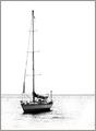
| 10/10/2005 11:28:09 PM |
The Jolly Boatby RikkiComment: This effect almost gives it the look of a quick sketch. I think it would probably be a good photo either more "realistic" or kept as is...I would like it either way. I think your crop and positioning of the boat and horizon on this are perfect. |
| Photographer found comment helpful. |
| 10/10/2005 11:25:45 PM |
Gone are the Daysby RikkiComment: I really like the angle on this one, and once again nice rich tones and color. A very cool building and sign and the diagonal aspect really adds interest. I wouldn't change a think on this one (I don't say that too often! I'm pretty nit picky!) |
| Photographer found comment helpful. |
| 10/10/2005 11:23:54 PM |
Sundial Bridgeby RikkiComment: Great lines and good color and clarity. I would probably boost the whites just a bit. It's a shame it was dq'd. :( You have a nice eye for simple, yet effective composition. |
| Photographer found comment helpful. |
| 10/10/2005 11:21:58 PM |
Somewhere Between Heaven and Earthby RikkiComment: Really cool shot. It would do well in a minimalist challenge too, I would think. Your colors are nice and rich and I think the composition has impact. |
| Photographer found comment helpful. |
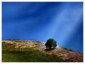
| 10/09/2005 12:42:06 AM |
new mexico treesby fstopopenComment: Wow...the lighting at that time of day was just spectacular for this shot. Amazing how one spot that's really a fairly average view can just come to life under the right circumstances...and you did a perfect job catching that moment. |
| 10/09/2005 12:40:32 AM |
|
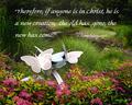
| 10/09/2005 12:36:08 AM |
New Life in Christby jpochardComment: Originally posted by SJCarter:
Wonderful choice of shots for the scripture selection. However, I think that your choice of fonts may be a little large and cumbersome for the subject matter in this particular case (just my humble opinion!). I think that if you were to select a slightly smaller and more delicate font for the text, the message might come across more favorably. Again, this is just my two cents. |
You know, I thought about that and tried it. However there is so much going on in the photo that smaller fonts really get lost. Maybe a different style would work better, Keeping the size. Thanks for taking the time to comment Jimmy. |
| 10/09/2005 12:34:05 AM |
|
| Photographer found comment helpful. |
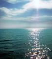
| 10/09/2005 12:23:01 AM |
Topsail Island Sunriseby SJCarterComment: Wonderful sparkles on the water. I'd like to see a bit more richess to the colors, but the mood is so relaxing in this one. It looks like it was taken in a boat out on the water in the middle of nowhere! |
| Photographer found comment helpful. |
Home -
Challenges -
Community -
League -
Photos -
Cameras -
Lenses -
Learn -
Help -
Terms of Use -
Privacy -
Top ^
DPChallenge, and website content and design, Copyright © 2001-2026 Challenging Technologies, LLC.
All digital photo copyrights belong to the photographers and may not be used without permission.
Current Server Time: 07/24/2026 05:20:55 AM EDT.