|
|
|
Showing 381 - 390 of ~2077 |
| Image |
Comment |
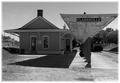
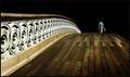
| 09/16/2005 10:51:56 AM | Shadows and Light (A Study in Black and White)by rayg544Comment: Greetings from the Critique Club!
This is a wonderful old time feeling shot of the train station. Though black and white is a nice choice for this, I always though sepia worked so much better for these types of shot, don't know why, just my preference I guess :)
I didn't get a chance to actually vote in this challenge, if I did, I probably would have given this a 5. It's a nice composition but the contrast is not really there. I see no real blacks or whites in the shot, mostly grays and it's very bright overall but nothing really stands out and pulls me into the shot. Also, it seems a tad off balance overall for some reason, maybe if you moved to the right just a bit and shot straight down the canopy area, making it look like one piller and having the piller on the right side line if you used the rule of thirds?
Also the finishing on the edge does nothing for me. It seems to take away from the shot more than add to it. Perhaps a solid white border on the outside to hold it all in, the fading effect in current use seems to suck more out than add in.
Overall, it's a very nice shot and I would love to see any reshoot or work you might try on this.
Hope my comments help!
Deannda |  Photographer found comment helpful. Photographer found comment helpful. |
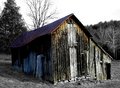
| 09/16/2005 10:40:59 AM | Fawning Barnby SJCarterComment: Greetings! First, what is a Fawning Barn?
Second, I like the concept of 1/2 b&W, 1/2 color but you left some color, to me, in strange places and the color that is there doesn't stand out very much against the b&w part. On the back left corner of the barn you can still see the gree of the trees and grass, a bit distracting, but just a touch. On the barn itself, there is so little color left it almost blends into the background, maybe if you reversed the switch, left the trees and grass green and only did the barn b&w?
Also, while I know the building is leaning a bit on it's own, the overall picture seems slightly tilted to the left, maybe a very slight rotation to the right to balance it out?
Hope this helps! | | Photographer found comment helpful. |
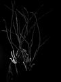
| 09/16/2005 10:24:03 AM | protective limbsby mesmerajComment: This is a wonderfully shot with feeling and mood but there are a few things that jumped right out at me and as a result, if I had the chance to vote on this challenge I would have given this one a 4 or 5.
First, nothing in the shot really grabs my attention to start with except the hand on the left, the left side is not blown out but it's so much brighter compared to the rest of the shot it pulls me away from everything else in the shot, my eyes keep getting drawn back to that highlighted hand. Maybe tone it down a bit or bring up the lighting just a tad in the rest of the shot to balance it out just a touch more.
Second, the negative space on the right does nothing for me, if you were going for the rule of thirds, you did that but it doesn't really work for me in this shot. There is already so much darkness and the additional black space on the right does not compliment the picture to me but more takes attention away from the main subject, right after I can finally draw my eyes away from the left hand I'm taken to the dark right side.
I'm guessing you want me to see the face, the expression and the desolation in the eyes. Using my magic envelope I took off the right side and had the crop right on the right side of the branches so they were leading me out of the shot, then my eyes were drawn to your eyes in the shot, following them up the branch and it made me wonder just what was on the other side of the edge that would cause you to look that way. It peaked my curiousity and therefore held my attention longer. The way the shot is now you are looking into black space, nothing to fear or be wary of.
My crop of your shot, hope you don't mind:

Now, your left hand isn't such a distraction for some reason, instead it draws me in on the left, making me follow the branch line, seeing your face and following it out to the right, making me wonder just what is out there that has you so wary.
Hope this helps.
Deannda
If you asked for a Critique on the photo from the Critique Club, consider it done, I belong. :)
P.S. (this is the edit), the rule of thirds could still work on this if the negative space was on the left instead of the right, don't have the original, have no idea if you could pull that off, but there you go.
Deannda Message edited by author 2005-09-16 10:26:53. | | Photographer found comment helpful. |
| 09/15/2005 12:51:49 AM | Black Jack Danielsby Buckeye_FanComment: Awww, I'm a sucker for animal shots. And this one is no exception. But sadly, I don't see a lot of contrast in the overall shot. While you have the white blanket and black dog the "pop" factor just isn't there. Maybe if the contrast was bumped up just a bit more to really bring out the difference between the two? There is to much gray in the white areas to really hit the spot for me.
Otherwise, I love the composition of the shot, the look on his face is priceless and the cropping, while nice, could maybe come in more on the right, taking out the paw area, leaving more of the face itself.
Otherwise, great job!
Deannda | | Photographer found comment helpful. |
| 09/15/2005 12:48:44 AM | Station 5by pinbokeshattaComment: Greetings from the Critique Club!
I didn't get a chance to vote in this challenge, life and all that but had I had the chance I probably would have given this image a 5 to start, possibly a 6.
I like the idea but the overpowering red in the shot overshadows any contrast the white STATION might have offered. Also the 5 itself seems a it out of focus, not sure if that was intentional, trying to keep the focus on the STATION but with it being such a large part of the image it's a bit distracting to me.
Also the orange line leading away from the top part of the 5, while a nice way to lead out of the shot doesn't really work for me, again it's competing against the STATION, and my attention is all over the place as a result.
Hope this help.
Deannda | | Photographer found comment helpful. |
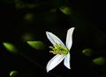
| 09/15/2005 12:44:51 AM | Sweet Autumn Vineby lytaComment: Greetings from the Critique Club!
I haven't been around much lately so I didn't get a chance to vote in this challenge but had I voted I would have probably started this out at a 7 and then possibly bumped it to an 8 if I had the chance to go back.
It's a lovely picture, the balance is well done and the contract is very well done. The bright white to the dark backdrop. The buds in the background are a bit distracting though to me personally. I like the shot, it would make a lovely print but the buds, especially on the left side are competing with the flower for my attention. If they were a bit darker like the ones on the right it might be better.
The crop also leaves me wanting just a bit, a tighter crop on the top, taking out that bud would really make this shot pop IMHO. I like the image but just a few tweeks and I would really love it!
Hope my comments help, thanks!
Deannda | | Photographer found comment helpful. |
| 07/05/2005 02:26:29 PM | The Journeyman by muur88Comment: Sorry about the comments, did not mean to offend.
Deannda
Won't happen again Message edited by author 2005-07-05 23:09:46. | | Photographer found comment helpful. |
| 06/13/2005 12:30:02 PM | Hidden Creekby JeremyFleuryComment: Read your comments in the thread and the comments here are right on with the post processing. You need to control the post processing and not use the Auto anything. That way you can see it bit by bit as it adjusts. I went to a workshop a couple of months ago and the gentleman that taught the session I was in said, "AUTO ANYTHING IS EVIL!!! NEVER TOUCH IT!!!" Also, never touch brightness and contrast, make all your adjustments in levels and curves. :O)
Deannda
It's a beautiful shot | | Photographer found comment helpful. |
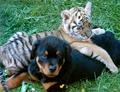
| 06/09/2005 10:58:22 AM | Innocent Friendshipby neophyteComment: Greetings from the Critique Club!
First off I have to say I have some prejudice towards this picture because I absolutely adore tigers. Rotties are okay, especially when a puppy but tigers get me every single time. But I will try to be a little objective when critiquing this shot. :)
I love the idea because there is so much natural beauty in animals of all species. The shot is overall very appealling but just a quick glance tells me that it's off for some reason. The color, the balance both seem a bit off. Upon closer inspection I see the color of the grass and the dog seem perfect but the tiger seems very muted for some reason. Now I know that baby tigers are not as vibrant as the adults but this one seems really muted to me.
The cropping also leaves me wanting more. Cutting off the end of each animals is cruel and mean! Just kidding! ;) But I would like to see the whole tail, not just the middle part and the missing paws on the dog, while giving you a line in and out of the shot makes it an incomplete shot to me. I would have rather seen the whole animal. But that's me. Please remember that all comments given here are strictly my personal opinion and meant to help.
Good Luck in future challenges.
Deannda | | Photographer found comment helpful. |
| 05/10/2005 10:17:17 AM | Silent Remindersby NeuferlandComment:
This was originally taken for the Freedom II challenge but was my first DQ because the one I entered had an illegal border on it. This is one of my favorite shots but there are a few things that bother me as well.
I like the overall shot, the composition of the shot, the way the headstones lead me out from the front to the back and the lighting was unreal that afternoon, it was later in the day, the sun was setting and I was driving around the circle in the veteran's section of Woodlawn Cemetary when the light on the front headstone just caught my eye. I stopped the car, rolled down the passenger window and started shooting. I choose this for the challenge because it reminded me that because of the men and women willing to go into harms way is the reason we have freedom today. And it doesn't matter if they were killed in action or died years later in the safety of their own home, the fact they were willing to go and be a part of protecting us was enough for me.
What bothers me about the shot, I had to do a lot of burning on the back ground above the headstones to get rid of a distracting fence and some trees. I could have/should have cropped it a little tighter on the top and it wouldn't have hurt the overall balance of the shot, I could have also cropped it a little tighter on the left, again, leaving out the distracting headstone to the left of the main focus, leaving an even crisper line for the viewer to follow.
This ended up being one of my favorites and I have a feeling that if I hadn't screwed up with the border it would have been my highest scoring shot to date. I had two copies made, one for fair last year and I took one down to Woodlawn Cemetary and left it on the caretaker's doorstep, no note, nothing, just thought they could either use it on display or find the family of the main headstone and give it to them if they wanted it. :) |
|
Showing 381 - 390 of ~2077 |
Home -
Challenges -
Community -
League -
Photos -
Cameras -
Lenses -
Learn -
Help -
Terms of Use -
Privacy -
Top ^
DPChallenge, and website content and design, Copyright © 2001-2026 Challenging Technologies, LLC.
All digital photo copyrights belong to the photographers and may not be used without permission.
Current Server Time: 06/11/2026 05:39:38 PM EDT.
|