| Author | Thread |
|
|
09/26/2005 06:31:56 PM |
it stands out.. as if popping out of the screen..i like it..
i also like what you did with the border and the grainy feeling, it suits this image very well |
|
 Photographer found comment helpful. Photographer found comment helpful. |
|
|
09/16/2005 10:51:56 AM |
Greetings from the Critique Club!
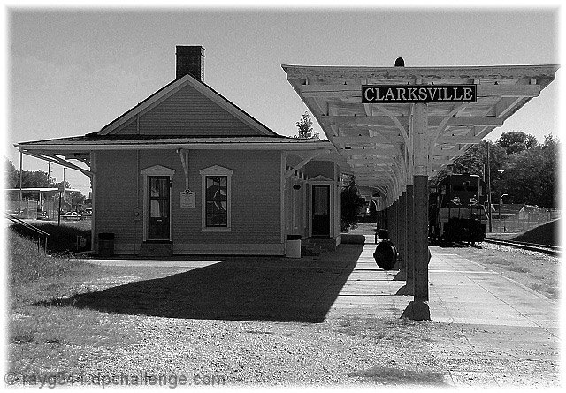
This is a wonderful old time feeling shot of the train station. Though black and white is a nice choice for this, I always though sepia worked so much better for these types of shot, don't know why, just my preference I guess :)
I didn't get a chance to actually vote in this challenge, if I did, I probably would have given this a 5. It's a nice composition but the contrast is not really there. I see no real blacks or whites in the shot, mostly grays and it's very bright overall but nothing really stands out and pulls me into the shot. Also, it seems a tad off balance overall for some reason, maybe if you moved to the right just a bit and shot straight down the canopy area, making it look like one piller and having the piller on the right side line if you used the rule of thirds?
Also the finishing on the edge does nothing for me. It seems to take away from the shot more than add to it. Perhaps a solid white border on the outside to hold it all in, the fading effect in current use seems to suck more out than add in.
Overall, it's a very nice shot and I would love to see any reshoot or work you might try on this.
Hope my comments help!
Deannda |
|
| Photographer found comment helpful. |
Comments Made During the Challenge  |
|
|
09/11/2005 06:23:05 PM |
|
Some contrast, but overall for me the grayscale values seem very similar |
|
| Photographer found comment helpful. |
|
|
09/11/2005 12:39:32 AM |
|
too much digital noise blowing out off of the buildings |
|
| Photographer found comment helpful. |
|
|
09/10/2005 10:06:21 PM |
|
Is that the "Last train ..."? |
|
| Photographer found comment helpful. |
|
|
09/08/2005 11:20:31 PM |
|
While this is a nice image, it isn't that contrasty. I don't see any true white and very little true black. Also I would drop the parantheses all together. |
|
| Photographer found comment helpful. |
|
|
09/07/2005 12:21:37 PM |
|
Clarksville, TN? check out Red's Smokehouse on Riverside Dr if it is C-ville, TN. Hadn't seen that station in years. Way to not let the bright areas get blown out. -6- |
|
| Photographer found comment helpful. |
|
|
09/07/2005 07:53:54 AM |
|
I'm a sucker for train stations (and, btw, didn't you do a great night scene of this station???). 8 |
|
| Photographer found comment helpful. |
|
|
09/07/2005 12:17:48 AM |
This is good, interesting.
Is that the last train? ;>} |
|
| Photographer found comment helpful. |
|
|
09/05/2005 06:11:16 PM |
|
I like this, but would have preferred to see a higher contrast - it would have met the challenge better &, I think, would have made it a strong image regardless of the challenge. |
|
| Photographer found comment helpful. |
|
|
09/05/2005 12:36:35 PM |
wow, I like this shot alot
the left side behind the building kinda takes the feel of the shot away and it looks like that may be an overturned trash can or something of that sort under the awning. I love the border and the exposure and dof is perfect. I would have put a very very slight desharp mask across this image but other than that great shot. clean up the left side and this would have been a 10, but I'm going to go with a 9 here |
|
| Photographer found comment helpful. |
Home -
Challenges -
Community -
League -
Photos -
Cameras -
Lenses -
Learn -
Help -
Terms of Use -
Privacy -
Top ^
DPChallenge, and website content and design, Copyright © 2001-2026 Challenging Technologies, LLC.
All digital photo copyrights belong to the photographers and may not be used without permission.
Current Server Time: 06/28/2026 08:16:03 AM EDT.