| Image |
Comment |
| 11/06/2003 08:02:02 AM |
Mercury Risingby catzilla23Comment: Very good idea and I like the title. Glad you explained who, I would have never know :) The statue is well lit but the distance in the shot is too much. The cropping could be tighter, leaving only the tower and the statue. The noise in the image is also very distracting. A 4 |
 Photographer found comment helpful. Photographer found comment helpful. |
| 11/06/2003 08:00:20 AM |
Still on the shelfby ChezComment: A display, very nice. Hat, gloves, umbrella and purse, every woman's needs on a chilly day. I like the idea and the overall concept is good as is the shot. What does jump at me though are two things, the shadows on and created by teh gloves. You have a blurred shadow under the gloves indicating there is light above the display yet a shadow cast across the gloves at the same time. And the blurriness of the purss and strap. I can't imagine it was moving at the time, if it was just DOF I would understand it but it looks like it's actually shaking. I started this at a 4 after but am moving it up to a 6 |
| Photographer found comment helpful. |
| 11/06/2003 07:54:51 AM |
A kiss...by YanklComment: What a sweet dog. The shot is a nice idea but the darkness of the subjects seems off just a bit. Not quite enough light, you really have to struggle to see any sort of detail. Also the noise in the shot is distracting. The cropping could have come in just a bit more from the right to create a better balance to my eye though the flow down the dogs neck and back is nice. I do have to be honest, you've hit on a pet peeve of mine, I love dogs, I have three of them, but I can't stand to have them lick me ::shudder::, can't explain it. For the shot a 4 |
| 11/05/2003 11:07:49 PM |
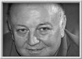
hello my sonby andlbComment: You have a nice looking dad. Say hello back to him for us! As for the shot, the cropping is too tight and the shape fo the shot, maybe if it was more squared. The frame is too big and is distracting in this shot. A 4 |
| 11/05/2003 11:05:29 PM |
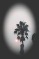
The Smoke Stands Stillby yamahondamomComment: I"m betting this was taken in California near the fires. I hope all is well with yours during this difficult time. As for this shot, the size throws me off and the tree poking in on the right is very distracting. The effect of the border is also distracting. a 4 |
| Photographer found comment helpful. |
| 11/05/2003 11:01:23 PM |
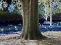
X-Ray Geeseby flauriComment: Oooo, what to say, what to say. This is an interesting shot to say the least. If you had gone for just the tree I think it might have worked better. The post processing has made the picture noisy and distracting, the huge trunk in the middle looks totally out of place, maybe if you had cropped it so the tree completely cut the shot in half? Or came from a different angle? A 4 |
| Photographer found comment helpful. |
| 11/05/2003 10:58:24 PM |
Everyday Thingsby byshenComment: yes they are. This shot has a lot of potential and I hope you don't mind my suggestions on it. I would have scrubbed the sink and faucet clean first, got a real shine on them, then placed the pan with plate in there. The foil on the back is good to help cover the backsplash but maybe if you had put it on some cardboard and really flattened it so either you had an overall crinkle effect or a smoother effect, either would have worked better to me. The cropping is good, the faucet handle brings you in, maybe just a little looser on the right so the whole plate was included. The lighting is also very good. Hope you try this again, if you don't I just might! ;) I had started at a 4 but am going to a 6 for a really potentially great shot |
| Photographer found comment helpful. |
| 11/05/2003 10:54:09 PM |
I swear, he didn't move!by SoulHunter74Comment: I bet he didn't! He's cute, I have a friend who loves Moose and he would make a great addition to her collection. Anyway, you met the challenge requirement but the shot leaves me wanting. The use of negative space is overdone for this one and the white blow-out in the middle is really distracting. A 4 |
| Photographer found comment helpful. |
| 11/05/2003 10:52:50 PM |
Comic shotby kaynaroComment: OMG, what is that?????? Not sure I even want to know, eek! :) Okay, how this fits the challenge I'm not quite sure but we'll stretch the rules, a lot! As for the shot, the lighting is uneven and really hurts this shot for me. Also the white line down the right is very distracting and the tape on under his nose holding whatever that is coming around must have hurt like heck when you pulled it off! OUCH! ;) A 4 |
| 11/05/2003 10:50:45 PM |
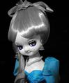
Bonnie Blueby WILDBLUEComment: My sister used to make these dolls. I think I had about 4 of them when I was growing up. She is still life without a doubt. The cropping is a bit tight on the top, her bow got cut off and the bottom part, what is that on her hair? It looks so ragged compared to the smoothness of the rest of the doll. The focus needs to be sharpened up a bit. A 4 |
| Photographer found comment helpful. |
Home -
Challenges -
Community -
League -
Photos -
Cameras -
Lenses -
Learn -
Help -
Terms of Use -
Privacy -
Top ^
DPChallenge, and website content and design, Copyright © 2001-2026 Challenging Technologies, LLC.
All digital photo copyrights belong to the photographers and may not be used without permission.
Current Server Time: 06/18/2026 11:05:10 PM EDT.