| Image |
Comment |
| 02/27/2004 06:58:07 PM |
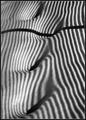
Snowy footprints with shadowsby pcodyComment: Excellent pattern and abstract shot! For the final you might consider cloning out some of the bigger sparkles on the left which look almost like dust (and equally distracting!) What is the shadow from? |
 Photographer found comment helpful. Photographer found comment helpful. |
| 02/27/2004 09:23:04 AM |
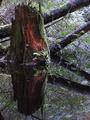
Old Stump Reflectedby robbiehComment: Good idea and good symmetry. But all the brush makes it too busy IMHO. I think these work better when they are simpler. |
| 02/26/2004 12:17:43 AM |
Midnight Moverby dtouch1Comment: Greetings from the critique club.
Hits: This was a really good idea for the black challenge. I like the contrast of the black and silver trim. I like the general direction that the composition took. It's very sharp, and there's a minimum of hot spots/glare from the trim.
Misses: My monitor is a bit dark and cannot be perfectly calibrated, but it's as close as possible (it's a Dell 1900FP). This photo still appears a bit too dark. Only the trim detail is discernable, there's no visible bends and form on the black part of the truck. Also, while the composition is in the right direction, the "cutting off" of the trim accessories at top hurts it a bit (though somewhat understandable to try and minimize the sky in the shot). Also, the grille is one of the best parts, and its only partly there, and has some perspective distortion.
Ideas. I think it would have been cool to try and get the grille as the focal point, and the truck as the contrast. Or as is, you might recrop and try to lighten just a tad.
Hope you get a chance to play with this idea some more! |
| Photographer found comment helpful. |
| 02/25/2004 10:10:17 PM |
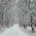
a roadby jmritzComment: Nice scene and view. Might just be an illusion, but the tree branches have small halos which look like a bit of oversharpening (and see the base of the tree on the right). I think a softer image would work here anyway (though the masses may not agree!) |
| Photographer found comment helpful. |
| 02/25/2004 10:08:03 PM |
Jump For Joyby bjallenComment: Wonderful moment! It's a shame that you weren't able to get as good stop action on the left as on the right. Although it's great to see both dogs, you might have a better photo if you crop the left out, and the setting might work better too. |
| Photographer found comment helpful. |
| 02/25/2004 07:01:44 PM |
50 years ago... defiance bred a Leader by RoosterComment: Excellent social commentary. Minor nits: on my monitor at least, the exposure on the boy is too dark; I wish the sign looked more real and less like a quick laser printout tacked to the wall (it looks too fake, which I assume and hope it was!) , and I think the DOF should have included the sign. |
| Photographer found comment helpful. |
| 02/25/2004 06:58:54 PM |
Conflicting Colorsby jonpinkComment: Well done studio shot, almost perfect but the pink seems to be poluted from an earlier attempt. Also, it would have been cool to have the pink meeting the yellow like the blue meets it so they all reach for the foreground. |
| 02/25/2004 06:57:19 PM |
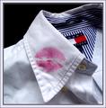
A conflict is about to start...by cjavierComment: Cute idea, very good composition. One issue: The uneven lighting and folds on the left side and front left of the shirt is a bit distracting to me. |
| Photographer found comment helpful. |
| 02/25/2004 06:55:43 PM |
Inner Conflict: Battling Despairby mocabelaComment: An excellent composition and exposure, good choice of B&W. Some minor hot spots on upper forehead, but but IMHO the main problem is simply that your neatimage settings are too high, giving the skin a plastic look rather than just clean of noise. Also, you can see signs of oversharpening by the lashes and eye brow. |
| Photographer found comment helpful. |
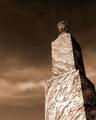
| 02/25/2004 08:45:10 AM |
1887 Graniteby cbellerComment: Greetings from the Critique Club:
Hits: This is a well composed natural gradient photo. The exposure looks about right. Sharpness is good and there isn't much noise. The overall tones have fine aesthetics.
Misses: Texture is downplayed here in the stone at this angle and with this light. The granite looks is pretty smooth, so it's really the engraving, the overall shape of the stone, and the clouds that represent surface texture here. And the engraving is not even very visible here.
Ideas. Perhaps another source of light from an assistant angled onto the stone would have brought out the engraving. I think a perspective shift might have made it more dynamic as well: perhaps you could have captured the stone angling on the diagonal of the shot, with an even sharper perspective. Or found a stone with a broken off area so an unsmoothed area of the granite were visible.
Nice picture overall! |
| Photographer found comment helpful. |
Home -
Challenges -
Community -
League -
Photos -
Cameras -
Lenses -
Learn -
Help -
Terms of Use -
Privacy -
Top ^
DPChallenge, and website content and design, Copyright © 2001-2026 Challenging Technologies, LLC.
All digital photo copyrights belong to the photographers and may not be used without permission.
Current Server Time: 07/24/2026 12:45:10 PM EDT.