Greetings from the critique club.
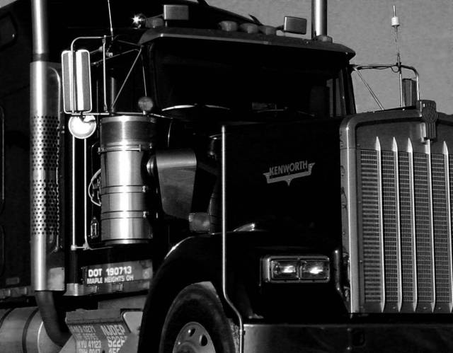
Hits: This was a really good idea for the black challenge. I like the contrast of the black and silver trim. I like the general direction that the composition took. It's very sharp, and there's a minimum of hot spots/glare from the trim.
Misses: My monitor is a bit dark and cannot be perfectly calibrated, but it's as close as possible (it's a Dell 1900FP). This photo still appears a bit too dark. Only the trim detail is discernable, there's no visible bends and form on the black part of the truck. Also, while the composition is in the right direction, the "cutting off" of the trim accessories at top hurts it a bit (though somewhat understandable to try and minimize the sky in the shot). Also, the grille is one of the best parts, and its only partly there, and has some perspective distortion.
Ideas. I think it would have been cool to try and get the grille as the focal point, and the truck as the contrast. Or as is, you might recrop and try to lighten just a tad.
Hope you get a chance to play with this idea some more! |