| Image |
Comment |
| 11/06/2003 11:42:08 AM |
Forgottenby SonifoComment: Nice!! IF it were up to me, this would be my choice for winner so far. I just love the colors and focus. The lighting is brilliant .. this one really makes you think. :) I do with the black on the left side was a tad bit lighter, but its not a big thing. Excellent job! 9 |
 Photographer found comment helpful. Photographer found comment helpful. |
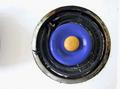
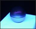
| 11/06/2003 11:38:40 AM |
The Smoke Stands Stillby yamahondamomComment: the lens flare (or whatever it is) in there looks bad
The contrast seems to be a little low, could be boosted
the object cut off to the bottom right is a distraction and doesn't need to be there
the plant would look better centered in the oval light |
| Photographer found comment helpful. |
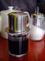
| 11/06/2003 11:37:06 AM |
Vietnamese coffeeby RipiComment: nice DOF and subject is nice and sharp
would probably look nice with a different background than the checkered type material that is there now .. perhaps a brigther material
7 |
| Photographer found comment helpful. |
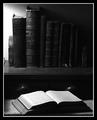
| 11/06/2003 11:35:33 AM |
Literatureby Firstrich1Comment: ligthing good
the empty space on the left side of the photo could be cut off right at the end of the first book
black and white works well here |
| Photographer found comment helpful. |
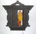
| 11/06/2003 11:34:17 AM |
Be Stillby PoobaComment: I think you could have focused more on the statue, there is just so much vegetation in this photo it is taking my eyes off the statue |
| Photographer found comment helpful. |
| 11/06/2003 11:32:58 AM |
Doorway To No Whereby RoosterComment: the white background isn't consistent - its darker in some places than others and it looks off...
I think this may look better on a different angle
|
| Photographer found comment helpful. |
| 11/06/2003 11:31:25 AM |
stovoramaby pixelflakeComment: The shadow on the left of the stove looks bad
The dirt on the white part of the stove is distracting and looks messy
|
| 11/06/2003 11:30:21 AM |
HUGO BOSSby HomunculusComment: Very nice colors, I like the soft touch. I think it would also look nice if the bottom surface was straight and when the whole way across the photo, rather than on the angle. What I like the most is the colors.. 7 |
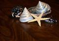
| 11/06/2003 11:29:12 AM |
Tiny treasuresby wolfenComment: I don't like the wood surface, especially since the grain is not aligned straight
the lighting could be improved |
| Photographer found comment helpful. |
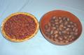
| 11/06/2003 11:27:50 AM |
Pecan Pieby kposeyComment: the blue sheet underneath looks bad with wrinkles in it
this is not in focus properly, and there should be better lighting, it looks too plain
|
Home -
Challenges -
Community -
League -
Photos -
Cameras -
Lenses -
Learn -
Help -
Terms of Use -
Privacy -
Top ^
DPChallenge, and website content and design, Copyright © 2001-2026 Challenging Technologies, LLC.
All digital photo copyrights belong to the photographers and may not be used without permission.
Current Server Time: 07/18/2026 05:36:06 AM EDT.