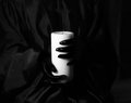
| Image |
Comment |
| 03/17/2011 09:17:35 PM |
|
 Photographer found comment helpful. Photographer found comment helpful. |
| 03/16/2011 01:13:14 PM |
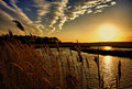
High Noon on Rue du Perrierby jagarComment: I'm gonna update this from a 9 to a 10 and favourite it.
I'm not quite sure what it is I like about it... but I like that something a lot. Fantastic work! |
| Photographer found comment helpful. |
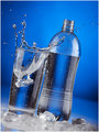
| 03/16/2011 09:54:31 AM |
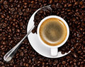
molto gustoby h2Comment: I think I prefer the more-square layout in shots, at least of late.
Your entry did better than how I think this would have cause of the way the coffee rose up on the sides of the cup. Not 'clean' and 'dpc-friendly' maybe? I love the softness, dof and cleanness of your entry.
That said... I want a cup of coffee now! |
| Photographer found comment helpful. |
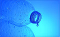
| 03/16/2011 09:18:53 AM |
Freshhh! by h2Comment: Very nice. I like the lighting and the water drops. |
| Photographer found comment helpful. |
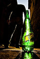
| 03/16/2011 07:27:37 AM |
Deathby WadeComment: Superb shot. Love it.
It might have been nice if there was smoke rising from the wick, so the concept of death just arriving.
Very well done, and congrats on the top ten. |
| Photographer found comment helpful. |
| 03/16/2011 07:24:26 AM |
The Sunby Bear_MusicComment: Sucks about dropping from 6.76 down. But perhaps the same happened to #3. Who knows?
Very nice entry. Congrats on the top 5! |
| Photographer found comment helpful. |
| 03/15/2011 08:58:02 PM |
|
| Photographer found comment helpful. |
| 03/15/2011 08:56:11 PM |
Espresso and Beansby timfythetooComment: This is basically nearly precisely what I wanted to do when I saw the challenge. Unfortunately I didn't have beans. Nor did I have the inclination to go out and get stuff to produce this image.
Superb composure and execution. It'll do well! 8 |
| Photographer found comment helpful. |
| 03/10/2011 07:11:54 AM |
|
| Photographer found comment helpful. |
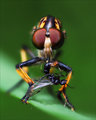
| 03/08/2011 08:56:21 AM |
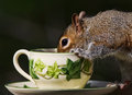
Caughtby rozComment: I was going to say this in my initial comment, but figured I'd wait until the challenge was over in case I might embarrass myself :)
I reckon this could have put breakfast on the fly in the red-ribbon position if they were both in the same competition. 4th for a bug macro in a free study.
Superb shot. |
| Photographer found comment helpful. |
Home -
Challenges -
Community -
League -
Photos -
Cameras -
Lenses -
Learn -
Help -
Terms of Use -
Privacy -
Top ^
DPChallenge, and website content and design, Copyright © 2001-2026 Challenging Technologies, LLC.
All digital photo copyrights belong to the photographers and may not be used without permission.
Current Server Time: 06/25/2026 06:56:38 PM EDT.