| Image |
Comment |
| 07/01/2004 10:20:14 PM |
|
 Photographer found comment helpful. Photographer found comment helpful. |
| 07/01/2004 10:18:07 PM |
The Brideby albeckComment: Oooo... That's a naughty bride showing a taste of the honeymoon. Overall, this image is quite good, but the sahdow in her armpit is weird. The colour looks all wrong. You may want to attempt to correct this. |
| Photographer found comment helpful. |
| 06/30/2004 09:23:11 PM |
sophisticatedby hopperComment: Nice head shot, but the position of the hands looks unnatural and gives a stronger "staged" feeling to the image than it should have and gives an overall feeling of awkwardness. However, I do like that themodel is looking over her glasses and that we don't see any reflections. I little more work could have removed the darkness under the eyes. |
| Photographer found comment helpful. |
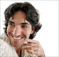
| 06/30/2004 09:17:54 PM |
flirtaceous. by theodor38Comment: Another self portrait. My, my. Aren't we a bit narcissistic? Just kidding... Love this shot. By far one of the best. Great high key image. One of, if not the only one, where I find the hand actually has its place in the shot. It shows that you have been playing with the portrait format before and are comfortable with it. I'll be very surprised if it doesn't ribbon. |
| Photographer found comment helpful. |
| 06/29/2004 05:54:08 AM |
Tamaraby PhilosComment: Beautidul little girl, but I find your crop way too tight for my liking. I would have rather seen a short in portrait orientation where you could have conserved the top of her head and her chin. |
| Photographer found comment helpful. |
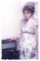
| 06/29/2004 05:51:44 AM |
1860's in technicolorby ladpupmoeComment: Nice concept, but if I remember well, portraits done in those days were shot quite so thight. I would have liked seeing a little bit more background around your subjects. |
| Photographer found comment helpful. |
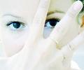
| 06/28/2004 10:28:50 PM |
Her eyesby MiinervaComment: Too bad you chose this shot that hides a pretty face. I find that the hand adds nothing to this shot. Good high key attempt, althought her hair at her temple is going green from the editing. Beautiful eyes. |
| Photographer found comment helpful. |
| 06/28/2004 10:25:44 PM |
Save a Horse, Ride a Cowboyby L1Comment: Interesting composition, but his skin looks way too smooth, as if he were a wax statue. I'm not sure how you achieved this through photo editing, but it takes some masculinity away from this shot. The bridge of the nose between the eyes is also a bit to pale and could have been burned slightly. |
| Photographer found comment helpful. |
| 06/28/2004 10:21:49 PM |
A Penny For Your Thoughtsby BooZonComment: This image is clear, but the light is dark and flat. Too bad, since the model seems to have nice blue eyes (that seem to have been PS'ed in...?) |
| Photographer found comment helpful. |
| 06/28/2004 10:15:34 PM |
Katby rubyrednailsComment: A nice try at soft focus, but the image seems too soft in some parts, especially around the eyes. I will suggest a good resource if you would like to perfect the technique of softening portraits without losing too much focus: "The Photoshop Book for Digital Photographers" by Scott Kelby. This book has sections on easy to use techniques to produce better portraits. |
Home -
Challenges -
Community -
League -
Photos -
Cameras -
Lenses -
Learn -
Help -
Terms of Use -
Privacy -
Top ^
DPChallenge, and website content and design, Copyright © 2001-2026 Challenging Technologies, LLC.
All digital photo copyrights belong to the photographers and may not be used without permission.
Current Server Time: 07/23/2026 11:46:24 PM EDT.