| Image |
Comment |
| 08/26/2002 12:50:00 AM |
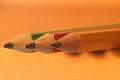
Hanaby muckpondComment: Congrats! I knew yours would do well. I think it might have hurt mine to have two so similar. The viewer can't help but compare the two, and yours wins hands down. Now stop stealing my ideas *wink* |
| 08/19/2002 01:18:00 AM |
Hanaby muckpondComment: Beautiful! This is almost identical to mine, but I like yours better. The blue works well, and your lighting is superb. |
 Photographer found comment helpful. Photographer found comment helpful. |
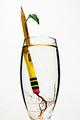
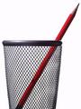
| 08/20/2002 12:08:00 AM |
Ticonderoga Cutting by mcmurmaComment: This is excellent! great idea. well executed. simple and direct. no distractions. only suggestions would be to crop lower on the glass maybe and try a little less exposure. it seems a bit bright. |
| Photographer found comment helpful. |
| 08/19/2002 01:29:00 AM |
|
| Photographer found comment helpful. |
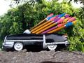
| 08/20/2002 12:40:00 AM |
family outingby queen 91Comment: Cute idea. A different angle that excluded the blown-out sky would have made it even better. |
| 08/19/2002 11:16:00 PM |
|
| 08/19/2002 01:37:00 AM |
|
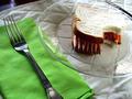
| 08/19/2002 01:48:00 AM |
Lunchby millerComment: My 11-year-old brother actually had this idea. He'll be very proud that someone actually did it :o) Nice job with the bite. |
| Photographer found comment helpful. |
| 08/20/2002 12:21:00 AM |
Office Spaceby magnetic9999Comment: I like the simplicity and white background. Light seems a bit too harsh. Would also try it without cropping the bottom off. |
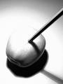
| 08/20/2002 12:14:00 AM |
Shadow and Lightby LanSnakeComment: This is cool. After looking at so many illustrations, I was really expecting that the apple would be a drawing. Works well with the overexposure - adds drama. |
| Photographer found comment helpful. |
Home -
Challenges -
Community -
League -
Photos -
Cameras -
Lenses -
Learn -
Help -
Terms of Use -
Privacy -
Top ^
DPChallenge, and website content and design, Copyright © 2001-2026 Challenging Technologies, LLC.
All digital photo copyrights belong to the photographers and may not be used without permission.
Current Server Time: 07/17/2026 12:32:25 PM EDT.