| Image |
Comment |
| 08/27/2002 11:19:00 PM |
Summer Daysby jaxxComment: This is a very calming shot. I like the colors and composition. Nice job. (but what's that shadow in the bottom left corner?) :o) |
| 08/27/2002 11:23:00 PM |
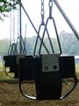
Swingsby MeggieComment: I love the pattern created here. That branch in the upper left is distracting, and a little less light in the background (later in the day) would be nice. |
| 08/26/2002 03:42:00 AM |
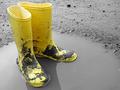
Puddle Stompersby bdshortComment: Well executed. I had this idea but couldn't have done it nearly as well. Top 5. |
| 08/27/2002 11:06:00 PM |
Yes, sir!by stephanComment: I think there may be a tad too much white space here, and the lighting is almost too bright - especially on the buckle. These are the sort of memories I try to block out, but it fits just the same. Nice job posting a controversial shot. |
 Photographer found comment helpful. Photographer found comment helpful. |
| 08/27/2002 11:37:00 PM |
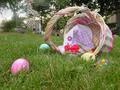
Early Morning Huntby SonifoComment: I like this one a lot, but I think it could have been composed a little better. The basket and eggs are great though the candy in the grass is hard to make out. The background is what bothers me. The left side seems much fuzzier than the right, and just what is that thing on the right - a house? Just a little improvement and this could be a great pic. Nice idea. |
| Photographer found comment helpful. |
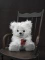
| 08/26/2002 01:51:00 PM |
With love from Grandma, on my 4th.by HBunchComment: I like the selective use of color. The chair seems to blend in too much with the background though. Perhaps more lighting on the foreground could have separated the two or you could go the opposite way and use a lighter background. Either one could show off the chair better. I'm also a little unsure about the crop. The chair is just barely cut off on the left and just barely inside the frame on the right. Maybe a different angle or perspective could help. There's quite a bit of empty space above the chair, but the bottom of the frame is cropped all the way up to the seat. Maybe there is some way to compose it so that the chair seems smaller - more to a child's scale. Overall, lovely picture with a few technical issues. Nice focus & exposure on the bear. White fur is often hard to shoot. ~indigo997 |
| Photographer found comment helpful. |
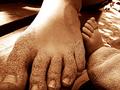
| 08/27/2002 11:12:00 PM |
Footsby seby20Comment: This is a lovely shot. Hope you don't get marked down for including a child's foot *gasp* :o) Nice lighting and composition. Only complaint is that fuzzy toe since the rest of the shot is in such nice, crisp focus. |
| 08/27/2002 11:10:00 PM |
|
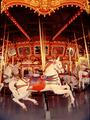
| 08/27/2002 11:03:00 PM |
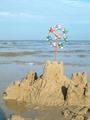
Merry Go Roundby DiarmuidComment: One of my top ten. The perspective is just really cool, and it fits the challenge well. The bottom of the shot seems a bit blurry somehow though. Nice job. |
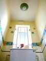
| 08/26/2002 03:41:00 AM |
Anybody Got A Step?by DazzermasComment: Very cool. You've successfully captured the feel of being small. It would help if the window weren't so bright, but I'm still giving a 9 for perfecting the angle. |
Home -
Challenges -
Community -
League -
Photos -
Cameras -
Lenses -
Learn -
Help -
Terms of Use -
Privacy -
Top ^
DPChallenge, and website content and design, Copyright © 2001-2026 Challenging Technologies, LLC.
All digital photo copyrights belong to the photographers and may not be used without permission.
Current Server Time: 07/17/2026 06:46:20 PM EDT.