| Image |
Comment |
| 09/18/2002 12:01:00 AM |
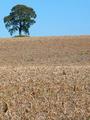
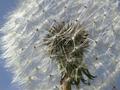
Oasisby floydComment: I really like this. The composition is just beautiful and an excellent entry for this challenge. My only real problem with it is the bright sunlight. I think you might have tried a diffrent time of day. The focus is also a tad soft maybe, but this is a hard focusing situation. 9 ~indigo997 |
 Photographer found comment helpful. Photographer found comment helpful. |
| 09/16/2002 01:06:00 AM |
|
| 09/18/2002 12:03:00 AM |
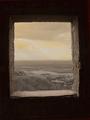
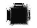
Hidden Lightby Chilly0999Comment: This is beautiful. Fill the sky with stars and it's a 10. Why is the sky so dark and the land so well lit??? Nice work. 9 ~indigo997 |
| Photographer found comment helpful. |
| 09/16/2002 01:20:00 AM |
|
| 09/16/2002 10:04:00 PM |
Can't Missby HBunchComment: This isn't bad at all, but I'm wondering if there's another angle that might add more interest. Maybe you coulda taken the pic more from the right and used the right side of the pool table to frame that side as you did on top. I'm left feeling that there is a little too much green table and not enough of anything else to anchor the pic. The lighting has sort of dulled the colors tho I'm not sure what to do about it. Maybe you could have taken the shot looking down a stick at the balls and used DOF to make it more interesting. You would still have a field of green in the pic but might have more interest. ~indigo997 |
| Photographer found comment helpful. |
| 09/16/2002 12:43:00 AM |
The Space Betweenby Mo ElfComment: I'm reconsidering my voting criteria, and bumping this one up. It's a good shot & I don't like scoring it low b/c it doesn't fit my idea of the challenge so... |
| 09/16/2002 01:03:00 AM |
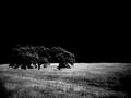
Shaftby millerComment: REALLY great work. It's so artsy fartsy. Looks like gallery material to me. Can I have a print with a black mat pleeeease? 9 ~indigo997 |
| Photographer found comment helpful. |
| 09/09/2002 02:28:00 AM |
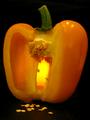
Yellowby AleciaComment: This reminds me of Halloween. Orange & Black. Jack-o-lantern feeling. The lighting is really cool, and the seeds are a nice touch. Minor distractions: blurry seeds in extreme foreground and light coming under pepper on left side. It's probably the dark bg, but it seems a tad too dark. Works with the eery mood tho. Overall, simple, clean, well-executed shot. ~indigo997 |
| Photographer found comment helpful. |
| 09/09/2002 01:46:00 PM |
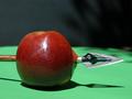
Son of 'Son of Man' (Magritte Revisited)by ClubJuggleComment: This is really cool. Great idea! Love the hat. Maybe we just don't have enough art folks around here. The lighting seems a bit flat maybe and the apple color doesn't pop like it could (the glare on it is distracting). The shadow on the wall is also a tad bothersome. Still, this photo stands out and is a great alternative to all the boring fruit pics. A+ for creativity even if it wasn't original. ~indigo997 |
| Photographer found comment helpful. |
| 09/11/2002 12:33:00 AM |
--- shades of William Tell.by npageComment: Nice shadow! Good focus. Blown out highlight on apple is bothersome. Also not sure about the green and different colored bg. Might have looked better with a continuous color. |
Home -
Challenges -
Community -
League -
Photos -
Cameras -
Lenses -
Learn -
Help -
Terms of Use -
Privacy -
Top ^
DPChallenge, and website content and design, Copyright © 2001-2026 Challenging Technologies, LLC.
All digital photo copyrights belong to the photographers and may not be used without permission.
Current Server Time: 07/18/2026 03:49:03 PM EDT.