| Author | Thread |
Comments Made During the Challenge  |
|
|
09/22/2002 09:44:00 PM |
|
I could! LOL Nice shot. Certainly meets the challenge and nice color. Good luck in the challenge! Grayce aka Gracious |
|
 Photographer found comment helpful. Photographer found comment helpful. |
|
|
09/22/2002 09:23:00 PM |
|
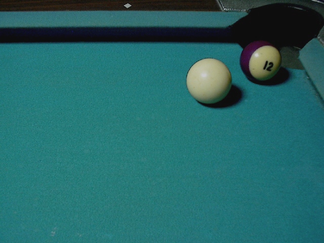
Heh, I'd probably end up scratching on that = P Nice concept, but I think the picture is a little dark, nice shot |
|
| Photographer found comment helpful. |
|
|
09/20/2002 03:11:00 PM |
|
Underexposed, soft focus, and sharpening artifacts. |
|
| Photographer found comment helpful. |
|
|
09/20/2002 02:39:00 PM |
|
Very creative shot, but your image suffers a bit of quality. The colors seem dark and dull, and it looks like you fixed a focus problem with sharpening tools. |
|
| Photographer found comment helpful. |
|
|
09/20/2002 02:06:00 PM |
|
Nice use of color for negative space. The only change I might suggest would be to crop it so that you couldn't see the edge of the pool table at the top. karmat |
|
| Photographer found comment helpful. |
|
|
09/19/2002 09:16:00 PM |
|
... but you can scratch. Nice colours. 7 |
|
|
|
09/19/2002 12:44:00 PM |
The color in this image is a little flat. I can't really find something here that jumps out and grabs me...
Meets Challenge: 10
Technical Merit: 5
Artistic Merit: 3
Creative Merit: 5
WOW Factor: 2
Score: 5 - JMSetzler |
|
| Photographer found comment helpful. |
|
|
09/18/2002 06:47:00 PM |
|
|
|
09/18/2002 11:58:00 AM |
|
It will better with the 8 ball. Nice shot. |
|
|
|
09/17/2002 10:45:00 PM |
|
I could probably miss that shot. |
|
|
|
09/17/2002 03:25:00 PM |
|
Very cool idea and use of negative space. The long shadow is a little distracting to me, however. |
|
| Photographer found comment helpful. |
|
|
09/17/2002 02:14:00 PM |
|
compositionally and conceptually, this shot rocks the house! however it's a little let down by focus and noise issues. i'm assuming this was a hand-held in low light. mag99 |
|
| Photographer found comment helpful. |
|
|
09/17/2002 10:31:00 AM |
|
can't miss but you can follow it in if you use the wrong kind of english. I think the picture could use the addition of a cue stick to add more interest. |
|
| Photographer found comment helpful. |
|
|
09/17/2002 08:56:00 AM |
|
If this were just a bit more in focus, and a bit brighter.... Because the NS is used well here to tell the story... Good effort. |
|
| Photographer found comment helpful. |
|
|
09/17/2002 05:09:00 AM |
Composition: Nice composition spoiled for me by poor focus and noise5 Lighting: 4
Appeal:6, Total Rating 6 Sulamk
|
|
| Photographer found comment helpful. |
|
|
09/17/2002 02:47:00 AM |
|
strong use of the negative space. could use a bit more directional light |
|
| Photographer found comment helpful. |
|
|
09/16/2002 11:46:00 PM |
|
good use of negative space. I wish the cue ball was a bit more white compared to the pool table green felt....otherwise good idea. cmcvety. |
|
| Photographer found comment helpful. |
|
|
09/16/2002 10:04:00 PM |
This isn't bad at all, but I'm wondering if there's another angle that might add more interest. Maybe you coulda taken the pic more from the right and used the right side of the pool table to frame that side as you did on top. I'm left feeling that there is a little too much green table and not enough of anything else to anchor the pic. The lighting has sort of dulled the colors tho I'm not sure what to do about it.
Maybe you could have taken the shot looking down a stick at the balls and used DOF to make it more interesting. You would still have a field of green in the pic but might have more interest. ~indigo997 |
|
| Photographer found comment helpful. |
|
|
09/16/2002 04:09:00 PM |
|
Good idea, but needed better light. Colors are a bit too flat. IMHO.... Good luck. Score 6 Justine |
|
| Photographer found comment helpful. |
|
|
09/16/2002 02:17:00 AM |
|
This is a little too dark. Good place to crop the picture. 4 |
|
| Photographer found comment helpful. |
Home -
Challenges -
Community -
League -
Photos -
Cameras -
Lenses -
Learn -
Help -
Terms of Use -
Privacy -
Top ^
DPChallenge, and website content and design, Copyright © 2001-2026 Challenging Technologies, LLC.
All digital photo copyrights belong to the photographers and may not be used without permission.
Current Server Time: 06/27/2026 08:55:26 AM EDT.