| Author | Thread |
Comments Made During the Challenge  |
|
|
09/22/2002 11:18:00 PM |
|
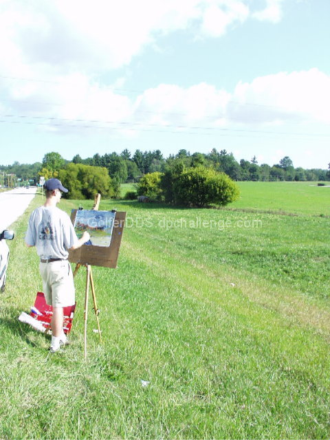
Lighting is too bright, contributing to a washed out appearance. The composition is good, but I might have tried a different aperture setting. |
|
|
|
09/22/2002 12:21:00 PM |
|
poorly framed (sign grass-tree-line and head all converge), overexposed |
|
|
|
09/20/2002 03:52:00 PM |
|
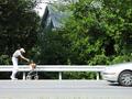
I hate power lines, but I suppose they are necessary. If it had been possible, I think cropping the car out and cropping just below his feet and including more to the left and at the top would be effective. karmat |
|
|
|
09/19/2002 11:56:00 PM |
|
good but would crop the car and power lines out |
|
|
|
09/19/2002 04:42:00 PM |
|
I would like to see this landscaped, closer to the artist, and stopped down a couple. The brightness is causing the edges to catch a video haze, and could benefit from a bit less light. |
|
|
|
09/19/2002 12:41:00 PM |
I think this photo is a bit over exposed... A polarizer could help in a situation like this...
Meets Challenge: 3
Technical Merit: 5
Artistic Merit: 3
Creative Merit: 5
WOW Factor: 2
Score: 4 - JMSetzler |
|
|
|
09/18/2002 06:31:00 PM |
|
Could you have gotten a better shot from over his shoulder? I know it is overdone to do that, but I think some of what he is painting got lost in your image and takes away from your shot. Nice job, though. |
|
|
|
09/18/2002 02:29:00 PM |
|
This is good. I think I would have liked it a little better if you could have cropped the road out.7 boyte1 |
|
|
|
09/18/2002 03:53:00 AM |
|
Could have been more cropped at the left to remove the car, could have cropped the bottom a bit too. |
|
|
|
09/17/2002 10:15:00 AM |
|
Nice composition, except for car. Focus? |
|
|
|
09/17/2002 08:43:00 AM |
Composition: 6
Lighting: good 5,
Appeal: 5, Total Rating 5 Sulamk
|
|
|
|
09/16/2002 04:33:00 PM |
|
I dont see the negative space. Too much going on in the background |
|
|
|
09/16/2002 03:12:00 PM |
|
this could have been cropped better... getting rid of the car and the road would have emphasized the negative space. |
|
|
|
09/16/2002 01:08:00 PM |
|
Little over exposed here and needed to move around so as to leave the car out of the shot. That or have the whole car in the shot. Still I see what you were going for and I like the idea. Score 5 Justine |
|
|
|
09/16/2002 01:20:00 AM |
|
This has unrealized potential. Needed to get rid of the road and car, and work on the exposure. |
|
Home -
Challenges -
Community -
League -
Photos -
Cameras -
Lenses -
Learn -
Help -
Terms of Use -
Privacy -
Top ^
DPChallenge, and website content and design, Copyright © 2001-2026 Challenging Technologies, LLC.
All digital photo copyrights belong to the photographers and may not be used without permission.
Current Server Time: 06/29/2026 10:31:44 AM EDT.