| Image |
Comment |
| 01/13/2003 11:55:32 PM |
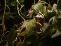
Stranger In A Strange Landby BadPiggComment: My first thoughts on this are that it seems too dark and it has good focus. The lighting seems a bit harsh in the center while the outer edges are too dark. That does help lead the eye to the center, but once I get there I have a hard time making out anything. There are too many little things competing for attention. I think it would work better to have one brightly colored object to contrast with all the foliage. Perhaps a little red sailboat or fish or something else that would seem totally out of place. I would also even out the lighting and diffuse it to avoid the glare on the water droplets. Placement of the (is it santa?) is good in the frame. This was a tough challenge! |
 Photographer found comment helpful. Photographer found comment helpful. |
| 01/13/2003 11:46:36 PM |
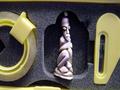
A Pythagoras or a Freud?by kenboComment: Yet another photo that probably suffered from people just not "getting" it. I think that it could be cropped a little tighter and probably lit better. The shadows seem really dark. The little guy is really cute. He is very centered which doesn't usually work but, since there are three potential subjects in the photo, it works ok here. Interesting shot that makes you think but doesn't really have the "wow" factor needed for high scores around here. Creative take on the challenge. Good photography skill. I think you could have come up with other interesting settings for the same little subject - putting him in the foreground and using shallow DOF - that could have probably scored higher. |
| Photographer found comment helpful. |
| 01/13/2003 11:38:22 PM |
Stranger in a Strange Landby clickerComment: I think that this photo might need more of an explanation as I'm pretty sure that a lot of people look at this and think "what the...??". I don't really understand what you were trying to create.
I think that the person shouldn't be so close to the edge of the frame. It feels like he(?) is sort of squished in. Also, having just that little bit of rock along the right side is bothersome - needs to have either more or less. The colors are really bright. Did you increase saturation any? It adds to the "weird" mood of the shot. Really a tough lighting situation that you seem to have handled fairly well. |
| Photographer found comment helpful. |
| 01/13/2003 11:22:50 PM |
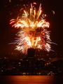
New Years from the Needle by timj351Comment: There were obviously quite a few people who really liked this photo, but I have to admit that it didn't really "speak" to me. It is a night shot of course but seems overly dark to me. The fireworks jump out, but you have to really look to see the rest of the scene. I do like how the fireworks frame the tower. Exposure on this sort of shot is difficult, and you seem to have done a pretty good job at retaining some of the colors in the firworks. The perspective could be a little better if the tall building weren't directly between the camera and the subject. The cityscape is too dark to be of much interest. The real draw in the shot is smack dab in the center which makes me wonder if you couldn't just crop off a lot of the rest. Being at a distance does help in taking in the whole scene, but it's a shame that there isn't some way to take advantage of the situation and use the surroundings to really add to the shot more. I'm not sure that there's really much you could do given the circumstances though. Focus, detail, and noise level are all really good given the conditions. ~critique club |
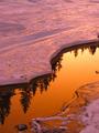
| 01/13/2003 10:08:57 PM |
Reflectionby Hotshot132Comment: Gorgeous lighting. Love the lines created by the ice. Focus on the ice seems soft though. It is more of a nature detail than a traditional landscape so I hope your score doesn't suffer from strict voters. Very lovely. 8 |
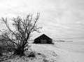
| 01/13/2003 10:07:18 PM |
Solitudeby stephanComment: Building is too centered but I like the black and white. Strong winter image. 8 |
| Photographer found comment helpful. |
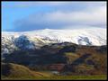
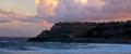
| 01/13/2003 10:06:38 PM |
Seasonsby auroraComment: Gorgeous sky. Great detail. Nice lighting. Could use a little more foreground - like inclusion of the tree off the right of the frame. 9 |
| 01/13/2003 10:05:54 PM |
|
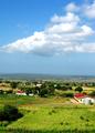
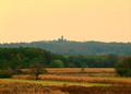
| 01/13/2003 10:04:55 PM |
Martin hillby ivanaComment: Gorgeous color. Foreground and sky blend so well. Horizon could be a little less centered. 9 |
| Photographer found comment helpful. |
| 01/13/2003 10:04:15 PM |
|
Home -
Challenges -
Community -
League -
Photos -
Cameras -
Lenses -
Learn -
Help -
Terms of Use -
Privacy -
Top ^
DPChallenge, and website content and design, Copyright © 2001-2026 Challenging Technologies, LLC.
All digital photo copyrights belong to the photographers and may not be used without permission.
Current Server Time: 07/18/2026 04:58:25 AM EDT.