| Image |
Comment |
| 01/29/2003 02:36:27 AM |
Drink Milk?by rj324Comment: I don't guess that I have to mention the background :) Picky, picky people, huh? Seriously, it would make the girls stand out much better. You don't necessarily have to have a solid sheet. I sort of like the candid nature of this rather than a studio feel. It would just be a lot stronger without the competing prints (and that line down the middle).
It fits the challenge and doesn't have any glaring technical problems. Focus is great, lighting is good (a few shadows but nothing too harsh). Something about the crop is a little off to me. Maybe I don't like having their arms amputated. I actually like cute kid shots but the fact that they both look like they are about to be sick sort of dampens my warm, fuzzy feeling.
Actually, I'm wondering if you couldn't do this with just one girl. Photos usually work better w/ an odd number of subjects. They aren't really interacting or playing off of eachother. I wonder how you would have done with a shot showing just one daughter. |
 Photographer found comment helpful. Photographer found comment helpful. |
| 01/29/2003 01:16:45 AM |
Dripping with Moo Juice!by boyte1Comment: The reminds me of that (was it an orange slice?) photo w/ the juice dripping off. I like the bg gradient. I have to kind of agree that sometimes natural just doesn't look as "natural" as something fake. This milk does look really watery. I also have to agree about the lighting and reflections on it. Did you diffuse the lighting? The right side of the cookie looks rather dark compared to the left side. Even, diffuse lighting is one of my biggest challenges, but I think it could've helped here. I sort of like the simplicity of just the cookie on the bg, but it would also be interesting to see it half dipped in some milk - esp if you could get the cookie to reflect in the milk - sort of like a cookie sunset. Then you wouldn't have this wet cookie look (which isn't all that appealing to me). Good focus (*lol* I typed food focus first... freudian slip?). Quality shot that deserved to do better IMO. This is about taking good shots, and this just doesn't have enough room for improvement to be sub 5. Nice camera btw :P
*lol* I also find the title a bit obscene for some reason. Maybe it's just my mind. |
| 01/29/2003 12:47:18 AM |
Yoghourtby lionelmComment: HEY! I think that most comments suggest that your white level is a little off. Was the background actually pink? because it looks like it may have been white originally. I'd rather not see it on white either though as I think another color works better. Perhaps a dark color would help. The reflective surface already makes the lighting seem very harsh. Was it diffused? Because of the type of surface and lighting, it's hard to tell for sure how good the focus is. The edges on the bottom part seem to be rather soft and not as distinct as they could be. As an abstract, this isn't as critical of course.
I do like the shape, but if I had been voting in "milk" then I'm not sure I would have really gotten the connection between this photo and the topic (without the title which I try not to rely on). Including atleast the top part of the container might have helped anchor it in dairy more.
It's a very abstract shot which probably didn't help the score any either. Of course there is always a trade-off in pleasing the crowds and pleasing yourself. I actually like abstract shots and wish they did better here. There's also a lot of blank space which IMO isn't really adding much to the image. I really like the blue and wonder if you couldn't have shown a bit more of it along the bottom.
Overall, nice abstract that could be tweaked - fits the challenge but just barely. |
| Photographer found comment helpful. |
| 01/27/2003 02:26:53 AM |
Living behind the Signby arnitComment: I am so unhappy about how low this finished! Only 3 other ppl agreed that this was an awesome shot? Maybe because the sign wasn't the subject. It is more of a distraction really, but the background is just so gorgeous that I can't blame you for focusing on it. I like the bold border too. |
| 01/27/2003 02:18:26 AM |
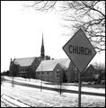
Jesus Xingby muckpondComment: HEY! This looks SO much like a church we have downtown. I think it's a methodist though, and I do think we have those signs here in TN. I like the B&W. There is something a little off about the composition though and I actually think I'd prefer more DOF. The sign may be the subject, but my eye quickly moves to the building in the back. It bugs me that it is just slightly blurry. There is a lot of white b/c of the sky and snow. The placement of the sign makes all of the "non-white" seem a little bunched up in the middle. I'm not really sure what other perspective/angle you could have tried, but *gasp* using the rule of thirds (it is currently pretty centered vertically) could've found a better placement for the sign maybe. Putting it up there in all that white space on the left might be an option. You don't really need the building on the extreme right or the parking lot back there. Showing more space in front of the church might help it stand out more. I do like how the tree frames the top of the shot though.
I actually think that the church in the snow is just a lovely scene and is probably why this scored so well. Changing the composition slightly could've made this a real winner.
If you can, try to put in the aperture and shutter info. It helps those leaving critiques and other photographers. |
| 01/26/2003 04:03:57 PM |
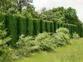
Man built these walls but life prevails.by MagsCoyoteComment: Why lie about where it was taken? Just wondering.
I think you should isolate a portion of the wall without the distracting bushes in front. The subject of this is all the foilage and texture, but I'm left wandering around looking for a place to focus my attention. A darker blue sky would be nice or at least more of the sky that you have. I didn't notice the grey box at first, but you might wanna get rid of it and either add more or less of the branches along the left side. I like the strong diagonal and the verticals of the wall. All that foilage just makes the shot too busy for me even though I love the green color. |
| 01/26/2003 12:29:38 AM |
Happy babyby CreativeFlyPhotoComment: Very cute shot, but maybe not the best fit for the challenge. Seems more happy than humor to me. I'm bettin that's why it scored so low. No better reason really. The focus might be a tad soft and the lighting isn't even ... but the composition is good. Not sure I like that her fingers are cut off but that's minor. Great expression capture. I like how you filled the frame. Do use the full 150kb! |
| Photographer found comment helpful. |
| 01/26/2003 12:01:04 AM |
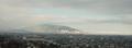
Ray of Light in Rainy Daysby mliborioComment: Is that fog or smog? If this were taken on a really clear day with a pretty blue sky and white, fluffy clouds then I bet your score woulda been much better. That bit of blue in the middle of the sky is a wonderful color. It really is an awesome view. My biggest complaint is that it's just too little to view well. I do like the panorama but not at the expense of being able to see what is in the shot. |
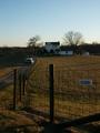
| 01/25/2003 11:45:25 PM |
stimson_10000by johnny_justjohnnyComment: Well... I gave this a 6 (which is high for me) so go figure. It's all about the average voter which I'm not obviously. I'm on a laptop which might mean that this photo doesn't look as dark to me as it did to some others. The bg is a bit underexposed though. I like the composition. The fence does cut off the viewer to some extent, but the road leads into the shot so it all evens out. I would have shown a little more of the road and a little less fence maybe. The house is also too centered (further emphasized by the strong vertical directly under it). I just like the country feel of this and that vehicle is classic. |
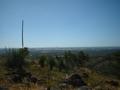
| 01/25/2003 11:18:25 PM |
Overlooking God's creationby Delta_6Comment: I think that this photo needs a center of interest or a focal point. Ppl are drawn to that tall plant which isn't all that interesting. The foreground is a little too dark (probably due to the harsh shadows created by the bright sunlight) and the bg is too hazy. You might also be careful about centering the horizon in the frame. You could try shooting in the same spot if you place some of the plants (perhaps the group of 3 from the center) in the foreground so that they are taking up more of the frame and attracting attention. Then shoot at a different time of day. Early morning and late evening have the best lighting and would probably have a more interesting sky. |
| Photographer found comment helpful. |
Home -
Challenges -
Community -
League -
Photos -
Cameras -
Lenses -
Learn -
Help -
Terms of Use -
Privacy -
Top ^
DPChallenge, and website content and design, Copyright © 2001-2026 Challenging Technologies, LLC.
All digital photo copyrights belong to the photographers and may not be used without permission.
Current Server Time: 07/18/2026 07:49:28 AM EDT.