| Author | Thread |
|
|
01/29/2003 12:47:18 AM |
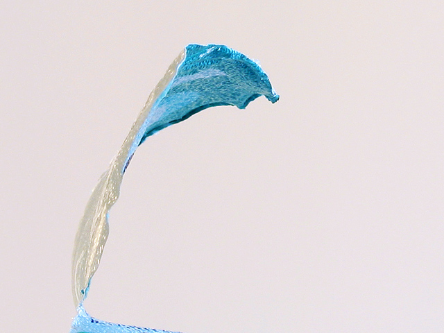
HEY! I think that most comments suggest that your white level is a little off. Was the background actually pink? because it looks like it may have been white originally. I'd rather not see it on white either though as I think another color works better. Perhaps a dark color would help. The reflective surface already makes the lighting seem very harsh. Was it diffused? Because of the type of surface and lighting, it's hard to tell for sure how good the focus is. The edges on the bottom part seem to be rather soft and not as distinct as they could be. As an abstract, this isn't as critical of course.
I do like the shape, but if I had been voting in "milk" then I'm not sure I would have really gotten the connection between this photo and the topic (without the title which I try not to rely on). Including atleast the top part of the container might have helped anchor it in dairy more.
It's a very abstract shot which probably didn't help the score any either. Of course there is always a trade-off in pleasing the crowds and pleasing yourself. I actually like abstract shots and wish they did better here. There's also a lot of blank space which IMO isn't really adding much to the image. I really like the blue and wonder if you couldn't have shown a bit more of it along the bottom.
Overall, nice abstract that could be tweaked - fits the challenge but just barely. |
|
 Photographer found comment helpful. Photographer found comment helpful. |
Comments Made During the Challenge  |
|
|
01/26/2003 01:48:55 PM |
|
This looks surreal, love two different colors. It looks a little sparse though, maybe needs an obscure background? |
|
| Photographer found comment helpful. |
|
|
01/24/2003 06:24:17 PM |
|
This is interesting and abstract, but I cannot quite work it out, is it a splash of yoghourt? Maybe a different colour background would have set this off nicely. |
|
| Photographer found comment helpful. |
|
|
01/23/2003 12:17:51 PM |
|
I can't quite tell what I'm looking at here! As an abstract it's kind of nice. The shapes are interesting, and the colour is vivid. Looking at it as a splash of interesting colour against white space, it's an appealing photo. |
|
| Photographer found comment helpful. |
|
|
01/23/2003 11:26:50 AM |
|
I would have liked it more if I could see some yorgort on the foil. Very simply shot. Background seems like it has a pink tint to it, but I like it. |
|
| Photographer found comment helpful. |
|
|
01/23/2003 02:25:30 AM |
|
To be completely honest with you. Ummm I'm not sure exactly what this is (sorry) however I really like the colour and the abstract effect. I'm still going to rate you high though for a great effort and a job well done. 8:) |
|
| Photographer found comment helpful. |
|
|
01/23/2003 12:13:18 AM |
|
Interesing abstract. Would have not known what it was without title. |
|
|
|
01/22/2003 05:41:47 PM |
|
hm. i wonder how many comments you are getting from people that don't get it. or that say that this doesn't meet the challenge. i'm not sure, either. the only thing i can think of is that this might be the lid of a yoghurt carton. i think a different background color could've enhanced this, i would've also liked this better in an abstract challenge rather than a milk/cheese kind of challenge, but that's just my personal taste. overall, other than speculating what it is, my interest isn't held very long by your photo, while the lid leads my eye through the picture, i am searching for something additional to also look at ... |
|
| Photographer found comment helpful. |
|
|
01/22/2003 05:23:18 PM |
|
Hmmm. I really don't know what I'm looking at here. Looks like a pure white background would have worked better to highlight the "yogourt". Jacko. 7 |
|
| Photographer found comment helpful. |
|
|
01/22/2003 04:59:11 PM |
|
Totally a personal preference: I think I would have tried to get the background a more pure white. I like the form and simplicity and sense of action in the shot. I have to admit, I can't figure out exactly what it is, but that's not stopping me from likiing it. |
|
| Photographer found comment helpful. |
|
|
01/20/2003 08:39:30 PM |
|
Great idea with giving the bare minimum of the product and allowing the viewer's mind to put the pieces together. |
|
| Photographer found comment helpful. |
|
|
01/20/2003 01:36:18 PM |
|
Interesting (confusing) shot! I really had to look at it to get the idea. (You're probably going go over the heads of many of the 2 second voters) Nice negative space, but IMHO, I think you needed a bit more of the lid so quick viewers could also get the idea. 7 Swash |
|
| Photographer found comment helpful. |
|
|
01/20/2003 11:53:59 AM |
|
background looks pink to me... dunno |
|
|
|
01/20/2003 11:01:54 AM |
|
| Photographer found comment helpful. |
|
|
01/20/2003 03:29:09 AM |
|
I do not know if this image is loading right. There apears to be a tidal Wave on the screen. |
|
|
|
01/20/2003 12:50:55 AM |
|
why the spelling? Interesting, thoughtful and different. Good luck. |
|
| Photographer found comment helpful. |
Home -
Challenges -
Community -
League -
Photos -
Cameras -
Lenses -
Learn -
Help -
Terms of Use -
Privacy -
Top ^
DPChallenge, and website content and design, Copyright © 2001-2026 Challenging Technologies, LLC.
All digital photo copyrights belong to the photographers and may not be used without permission.
Current Server Time: 06/29/2026 06:46:58 AM EDT.