|
|
|
Showing 641 - 650 of ~3332 |
| Image |
Comment |
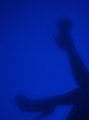
| 10/14/2010 07:13:30 AM | |  Photographer found comment helpful. Photographer found comment helpful. |
| 10/13/2010 10:40:48 PM | stepby zencowComment: would love this if the hand had been cropped out | | Photographer found comment helpful. |
| 10/13/2010 10:38:50 PM | sexy secretsby violiciComment: I like it....but....there's something about it that just isn't there | | Photographer found comment helpful. |
| 10/12/2010 05:04:12 PM | Danielleby bobdaveantComment: Greetings From the Critique Club
First Impressions:
WOW - she's got eyes you could fall into! Beautiful, gorgeous, stunning blue eyes!
Technical (Comp, lighting, color, focus):
love how the light reflects in her eyes, good compostion; although it could have been cropped just below her wrist and you wouldn't have lost anything; it's fine as it is but my point is, in this photo no one is looking at anything beside her face and eyes anyway; also I think the focus is good
Challenge:
n/a
Artistic/Emotion:
the white nail polish is a fine detail as well as the bracelet; she looks like the kinda girl I would want to be friends with
Summary:
I think ace flyman's comment sums it up best, "This image seems so natural in so many ways. "Lovely" is the only word I could come up with. Very well done!" | | Photographer found comment helpful. |
| 10/12/2010 04:15:04 PM | | | Photographer found comment helpful. |
| 10/12/2010 04:10:44 PM | Yardarmby dgodardComment: Greetings From the Critique Club
First Impressions:
Very nice shot - a little small maybe. I see that your photo is 640 x 425. They say, for these challenges you should always use the max that is allowed...."at least 160 pixels and no more than 800 on each side."
Technical (Comp, lighting, color, focus):
As FocusPoint mentioned your composition is good. Although a crop might have been nice just at the below where the poles go into the water....but maybe not, just depends on the mood you want to present
Challenge:
n/a
Artistic/Emotion:
artisticlly it's a nicely done piece; maybe could have even been better had you played with the colors and exposure a little to get an even better silhouette feel to it.
The scene certainly makes me want to be there.
Summary:
In summary? You have a VERY NICE shot of your local landmark. Between this shot and your first challenge entry  I'm anxious to see what more you have in store for us! Keep 'em coming! | | Photographer found comment helpful. |
| 10/12/2010 11:24:08 AM | You dare disturb the King?by Delta_6Comment: Greetings From the Critique Club
First Impressions:
OH MY GOODNESS! WOW!
Technical (Comp, lighting, color, focus):
composition, lighting, color focus? all magnificent! If I were able to take these type photos I see nothing I would change
Challenge:
n/a
Artistic/Emotion:
a piece that touchs us all on a level that we can understand - don't disturb our rest! very well excuted artistically and emotionally
Summary:
A perfectly done animal portrait - can't think of much more I can add - wish I could but this photo does it for me - no questions asked - no suggestions to be given | | Photographer found comment helpful. |
| 10/12/2010 09:42:05 AM | Serenity by Ja-9Comment: Greetings From the Critique Club
First Impressions:
Truthfully, flower pictures aren't my thing, but this one just jumped off the page at me! It's wonderfully done.
Technical (Comp, lighting, color, focus):
the lighting on the flower totally makes it pop! it just stands out from the bg which is equally as stunning
Challenge:
n/a
Artistic/Emotion:
a beautiful artistic piece
for a person who enjoys flower pictures this, I imagine, would be a stirring image
Summary:
You placed in the top 20, you got 4 favs, you got great comments! I mean what else is there? Well, there are 2 suggestions....a slight crop at the top to remove the hot spot....and there is a little distracting white spot under the lilly pad, looks similar to a copyright symbol, that coulda been cloned out. I know these are supposed to be in depth critiques, but how in depth can one go when the image is just on the verge of being perfect? :-) | | Photographer found comment helpful. |
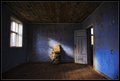
| 10/11/2010 03:15:42 PM | The Blue Roomby JohannesFrankComment: Greetings From the Critique Club
First Impressions:
I loved this the first time I saw it in the challenge and it is no different for me now.
Technical (Comp, lighting, color, focus):
simple and beautiful the way the light falls into the room from the window; the barrel, frame and board are wonderfully perfect there in the center, highlighted by that soft falling light - so simple yet so elegant amidst the disarray of the old house; the tones of the photo are marvelous; at first I thought the light from the other window just outside the door was distracting, but that's not it at all, instead of being distracting it is leading us deeper into the photo, making me wonder what else is in this building
Challenge:
if the challnege of a free study is to grab our attention you have certainly accomplished that
Artistic/Emotion:
artisticlly? not much I can say that hasn't already been said in your comments
emotionally? well tanguera's comment says it all
Summary:
What can I say here? I really don't know how to summarize this. Beautiful is not enough and yet awesome is too much! This photo is perfectly done in light, tone, artistic and emotional expression. WELL DONE! :-) | | Photographer found comment helpful. |
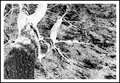
| 10/11/2010 01:56:48 PM | negative growthby kellmak10Comment: Greetings From the Critique Club
First Impressions:
very busy photograph; I think posthumous hit the nail on the head in describing it as frantic
Technical (Comp, lighting, color, focus):
my thoughts are had this been a positive image your composition would have been right on the mark; for me, as a negative image I feel the tree should have been closer to center which might have elimated the overall busy-ness of this photo. for some reason when I look at this my eye is drawn the right hand side (looking at the photo) and I'm not sure that's what you had in mind - then again, it could just be my eyesight.
I think the white part of your boarder should have been narrower or the black part wider
Challenge:
yes you have a negative image
Artistic/Emotion:
I would say this is an artistic piece that boarders on being an abstract.
Emotionaly? I don't have any opinion about this emotionally. Although it does make me think of a dark stormy night
Summary:
A nice negative photo that needs a little more of a "pop" or "wow" factor. |
|
Showing 641 - 650 of ~3332 |
Home -
Challenges -
Community -
League -
Photos -
Cameras -
Lenses -
Learn -
Help -
Terms of Use -
Privacy -
Top ^
DPChallenge, and website content and design, Copyright © 2001-2026 Challenging Technologies, LLC.
All digital photo copyrights belong to the photographers and may not be used without permission.
Current Server Time: 07/22/2026 10:52:05 PM EDT.
|