| Image |
Comment |
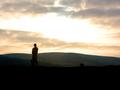
| 01/14/2003 10:55:09 AM |
It's too noiseyby PaulkComment: it is too noisey, i agree. i wonder why you submitted it. if you like the noise, then why the title. anyway. i like the composition with the person standing there gazing at the sky. the sky however is too blown out, and the foreground a little too dark for my preference. not knowing what camera and settings you used, and assuming that this is early morning or evening, i'm not sure what to suggest. i hear neatimage does wonders for noise (haven't tried it out yet myself). if you have a tripod, could you have tried to take the photo at a lower ISO setting with longer exposure? bracketing your shot may also give you a choice of different exposures to choose from. of course you may have already done that. |
 Photographer found comment helpful. Photographer found comment helpful. |
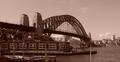
| 01/14/2003 10:52:18 AM |
Sydneys Greatest (Bridge)by RavenComment: wow, you really managed to make this photo look old, except maybe for some of the high-rises in the background. sepia works well here. i like how the bridge leads the eye through the photo. the flag staff in the foreground (right 1/4) is a tad distracting, but i don't know if you could've positioned yourself so that it wasn't in the picture. i guess you met the challenge, even though my definition would include more nature than buildings, but i definitely still see the intent. nice photo :) |
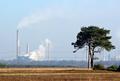
| 01/14/2003 10:50:25 AM |
Blot on the Landscapeby paynekjComment: kind of meets the challenge. i would personally have preferred more landscape with maybe a single building, but i can see where you are coming from. i like how the tree and the foreground are in much more intense colors whereas the factories and the smoke are somewhat muted in the background. positioning of the tree in the shot is nice. overall a good photo :) |
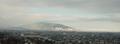
| 01/14/2003 10:48:43 AM |
Ray of Light in Rainy Daysby mliborioComment: kind of fits the challenge. i've read a lot of the discussion whether buildings could be included or not. i think i would like the "natural" part to be predominant, but i can accept your shot as landscape anyway. your title indicates that it was rainy, that would account for the somewhat muted colors. i would prefer them to be brighter, even if that meant having to photograph on a different day, if possible. i do like the scale of the mountains in comparison to the city before them. |
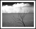
| 01/13/2003 05:15:10 PM |
Desertby JackoComment: personally, i'm not a big fan of b&w for landscapes (yes, i know of Ansel Adams, i'm still not a fan ;), but i guess this is one of the pix that i can actually work for. gives it an even more desolate feeling. i like the sky, the contrast of the white clouds against the black at the top, and the tree definitely gives your eyes something to focus on. i think i would like to see all of it though. the white border works well, the black around that does, too, except i think it's a little too wide. |
| Photographer found comment helpful. |
| 01/13/2003 05:00:01 PM |
Beach Landscape. A closeupby cbonsallComment: very nice photo. i like how the shade and the sun divide the picture, great texture. it's not the closest to my interpretation of a "landscape" (which really doesn't include macros/close-ups), but i'll give you the benefit of the doubt here as i can see where you are coming from. just slightly reducing your score. |
| Photographer found comment helpful. |
| 01/13/2003 08:24:01 AM |
Blinded by the Light by VipermikeComment: mike, congrats and welcome to dpchallenge. i've seen your work on fred miranda and like it a lot. you'll be doing well here, i'm sure :) |
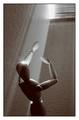
| 01/08/2003 06:11:00 PM |
Resolution...by DavenitComment: hold the camera and take pictures :)
Originally posted by Lew:
Now tell me what to do with these darn hands. |
Message edited by author 2003-01-08 18:11:21. |
| 12/20/2002 04:14:43 PM |
Searching For Signs Of Intelligent Life...by GeneralEComment: challenge met. i like the format and the color here a lot. the title also adds a nice "angle" to this. makes me feel like floating above the clouds, but not too high because the sun is breaking through right at the top of the photo. made it into my top 6 this week. :) |
| Photographer found comment helpful. |
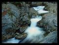
| 12/20/2002 04:12:26 PM |
Running Water by karmatComment: challenge met. beautiful contrast between the flowing water and the still and sharply focused rocks. nice contrast in tones, too. the water has a nice flow through the photo, and the frame works well, too. i wouldn't change a thing. my top 3 this week! :) |
| Photographer found comment helpful. |
Home -
Challenges -
Community -
League -
Photos -
Cameras -
Lenses -
Learn -
Help -
Terms of Use -
Privacy -
Top ^
DPChallenge, and website content and design, Copyright © 2001-2026 Challenging Technologies, LLC.
All digital photo copyrights belong to the photographers and may not be used without permission.
Current Server Time: 07/20/2026 05:55:06 PM EDT.