| Author | Thread |
Comments Made During the Challenge  |
|
|
01/19/2003 03:58:52 AM |
|
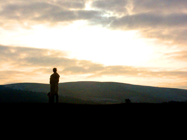
The light in the sky is really interesting. Very atmospheric and moody, with those silhouettes. The photo itself has a bit of noise (ironic?). Using Neatimage could sort it out. |
|
 Photographer found comment helpful. Photographer found comment helpful. |
|
|
01/17/2003 11:50:05 PM |
|
It is a bit too noisey. Perhaps because you only used 45 kb of the 150 kb file size allowed. That and Neat Image would help! |
|
| Photographer found comment helpful. |
|
|
01/17/2003 07:09:34 PM |
Overall I really like the picture, the strong contrasts are attractive to the eye, too bad you could not have catptured a sunset, or clearer skies.
Good job =) |
|
| Photographer found comment helpful. |
|
|
01/17/2003 02:44:26 PM |
The title fits well :-/
I guess you've tried to brighten up what were very dark hills? Kudos for trying rather than just presenting a silhouette.
It's a good idea, and very difficult to pull off. The composition is good, but the noise & blown out sky take away from it. Good try. |
|
| Photographer found comment helpful. |
|
|
01/17/2003 12:37:29 PM |
|
hIS SILOUHETTE RUNS INTO THE HILL SHADOW AND LOOKS PRETTY BAD! |
|
| Photographer found comment helpful. |
|
|
01/17/2003 09:33:03 AM |
|
Looks like a painting. Nice sky. Like the silhouette. Highlight of this pic for me is the subject and his placement, which is excellent. Nice photo - Inspzil |
|
| Photographer found comment helpful. |
|
|
01/16/2003 10:39:03 PM |
|
Difficult to focus on anything here. Perhaps a `fill flash` would have helped to bring something out in the forground to bring the eye forward. The sky is a bit overexposed. I like the idea you had here of the subject being alone. |
|
| Photographer found comment helpful. |
|
|
01/14/2003 10:03:19 PM |
|
It is a bit noisy :o) I think you have a nice opportunity here. The figure should be isolated more (it looks like there is maybe another person beyond the first). Maybe using a little lower perspective wouldn't cut the person in half and would help them stand out more (placing them against the sky). The sky also seems a little overexposed. Would it have been possible to expose it a little less? There seems to still be some detail in the person (not yet a true silhouette) so maybe you could have captured more color in the sky. |
|
| Photographer found comment helpful. |
|
|
01/14/2003 03:09:53 PM |
|
humm ... seems a little grainy .. maybe over exposed .... but it's damn nice |
|
| Photographer found comment helpful. |
|
|
01/14/2003 10:55:09 AM |
|
it is too noisey, i agree. i wonder why you submitted it. if you like the noise, then why the title. anyway. i like the composition with the person standing there gazing at the sky. the sky however is too blown out, and the foreground a little too dark for my preference. not knowing what camera and settings you used, and assuming that this is early morning or evening, i'm not sure what to suggest. i hear neatimage does wonders for noise (haven't tried it out yet myself). if you have a tripod, could you have tried to take the photo at a lower ISO setting with longer exposure? bracketing your shot may also give you a choice of different exposures to choose from. of course you may have already done that. |
|
| Photographer found comment helpful. |
|
|
01/14/2003 05:30:50 AM |
|
The noise adds to the mystique of the pic. Cool. 7. |
|
| Photographer found comment helpful. |
|
|
01/13/2003 11:50:28 PM |
|
Nice variation of our theme! |
|
| Photographer found comment helpful. |
|
|
01/13/2003 06:57:07 PM |
|
Maybe a little, but the composition is interesting and I like the colors. |
|
| Photographer found comment helpful. |
|
|
01/13/2003 06:48:23 PM |
|
Great idea but it looks like a bit too much contrast or sharpening on editing. Cub |
|
| Photographer found comment helpful. |
|
|
01/13/2003 06:10:36 PM |
|
Interesting. I like the bright/dark contrast. |
|
| Photographer found comment helpful. |
|
|
01/13/2003 02:21:45 PM |
|
But the composition is pretty good. I like the human element, it creates depth and scale. |
|
| Photographer found comment helpful. |
|
|
01/13/2003 11:38:00 AM |
|
| Photographer found comment helpful. |
|
|
01/13/2003 08:46:13 AM |
|
if it is too noisy, then use neat image to correct it. jgillard5 |
|
| Photographer found comment helpful. |
Home -
Challenges -
Community -
League -
Photos -
Cameras -
Lenses -
Learn -
Help -
Terms of Use -
Privacy -
Top ^
DPChallenge, and website content and design, Copyright © 2001-2026 Challenging Technologies, LLC.
All digital photo copyrights belong to the photographers and may not be used without permission.
Current Server Time: 06/29/2026 02:22:46 PM EDT.