| Image |
Comment |
| 06/23/2003 01:55:06 PM |
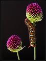
Menacing elegance by jjbeguinComment: What was I thinking ... "possible" contender for a ribbon ... you blew everyone out of the water. Congrats on such a wonderfully deserved win! |
| 06/23/2003 01:54:03 PM |
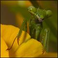
Praying Mantis by LarsPaysenComment: Well ... what's a half hour of work compared to a ribbon, right? Congrats on a deserved win. I did enjoy reading your description, it sounds just like something I'd do ... |
 Photographer found comment helpful. Photographer found comment helpful. |
| 06/23/2003 12:45:59 PM |
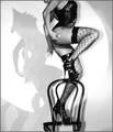
Cabaret Dancerby dimitriiComment: Wow. Totally wonderful composition, black and white is the perfect choice and I like the grain here, too. Kind of adds to the gritty nightlife feeling. One of my favorites so far. |
| Photographer found comment helpful. |
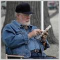
| 06/23/2003 12:43:42 PM |
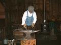
Smithing For Fun & Profitby JakComment: Great subject for this challenge. I really like how the background is dark and the guy is wearing a white shirt, that sets him apart nicely. I can still recognize the items in the background which add a nice context. The lighting is fine even though you have some highlights from the flash on the hammers in the bottom left, but that's not a big deal. The biggest single area of possible improvement would be in my mind to heed the lessons learned from the off-center challenge. The guy is almost right in the middle of the photo, I would have preferred a crop on either the left or right side (probably on the right just to the right of the fireplace, or a portrait crop to eliminate a lot more of the background. |
| 06/23/2003 12:40:16 PM |
Artisan - Wood Carverby RLSComment: Great subject for this challenge. I like how the artist is nice and focused and the background out of focus but still recognizable. I guess a tree is very appropriate. The angle of the photo is good for showing the artist. Two thing that would enhance the photo for me are (1) to position yourself such that the white pole isn't in the photo, it's very distracting (of course, I don't know what the rest of the surroundings looks like and whether that was possible) and (2) to somehow show a different angle of the carving ... w/out the title I would've had a hard time figuring out that he was doing woodcarvings. |
| Photographer found comment helpful. |
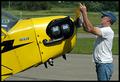
| 06/23/2003 12:36:19 PM |
Just Plane Workby alanfreedComment: Nice pun on the challenge in the title. I like the colors and technically, you have a pretty good photo. Like the yellow and how he's touching the propeller almost as if it is fragile and how you've included just enough of the plane to let the viewer recognize it. It's not the most overwhelmingly interesting image for me, but then, what work is ... |
| Photographer found comment helpful. |
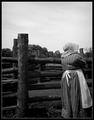
| 06/23/2003 12:32:31 PM |
Sentryby casualguyComment: Black and white definitely enhances the old-times feel that is envoked by the woman's dress, good choice. I don't mind seeing her back since she is looking out for something, however, I think this would be better portrayed if she was in the left of the photo and had room to look into on the right. I don't know what was to the right that might have prevented you from composing that way. Also, the sky adds nothing to the photo since it is bland and doesn't have much texture, cropping this to a squarish format (just above the post) might have enhanced this. |
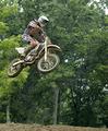
| 06/23/2003 08:21:41 AM |
Flyingby FranziskaLangComment: Thank you for all the nice comments. I agree that a blurred background from panning would've been better ... but I'm still happy with the results for a first attempt. More random photos from that day can be seen at my PBase account. |
| 06/20/2003 10:17:34 AM |
|
| 06/19/2003 12:55:21 PM |
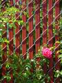
Lone Roseby timj351Comment: Nice capture and good fit for the challenge. I like all the crisscross lines in the photo. The lighting's a bit harsh though, it looks like you took this during the day in full sun. Maybe an early morning or late afternoon photo would have some softer lighting (the golden hours). |
Home -
Challenges -
Community -
League -
Photos -
Cameras -
Lenses -
Learn -
Help -
Terms of Use -
Privacy -
Top ^
DPChallenge, and website content and design, Copyright © 2001-2026 Challenging Technologies, LLC.
All digital photo copyrights belong to the photographers and may not be used without permission.
Current Server Time: 07/18/2026 01:46:40 AM EDT.