| Image |
Comment |
| 09/08/2003 06:50:36 PM |
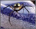
While you lay sunbathing...by Everyday ReneeComment: Awesome spidershot. Very unusual background, but it works. A little bit too bright in the top right (especially on the spider's leg) ... actually, now that I'm counting, there are only 6 legs. Either this is not a spider or you removed a few (ok, bad joke). Hope you are not getting hit too hard by the "it's a spider = 1" votes.
Anyhow, like the coloring and everything. There's not much I would change. :) |
 Photographer found comment helpful. Photographer found comment helpful. |
| 09/08/2003 06:47:22 PM |
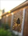
Web Building at Sundownby PaulMdxComment: This is one of the better ones of the spidershots. Your background is sufficiently blurry (if not very exciting) and the sunlight hitting the threads of the web highlight them well. Plus, your spider is actually in focus and on the right side of the web. Like it :) The biggest distraction is the blown out sky, I think you could significantly improve the photo by cropping as much as possible of the top.
Btw, since there's the hot discussion going on, I feel spiders are within the challenge guidelines and any score I give is purely based on the photo quality. Just thought I should add that. :) |
| Photographer found comment helpful. |
| 09/08/2003 06:44:17 PM |
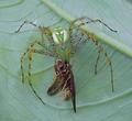
The Spider and the Beeby ibequeenComment: Wow, quite an unusual capture. Poor bee ;) I think this would be a fantastic shot if it was executed a little better. The straight-on, centered approach works here, and there's nothing distracting in the background which is wonderful. But the image doesn't seem to be really sharp/focused anywhere and the colors could do with a little boost, too. If you haven't already used USM (unsharp mask) here, that would be worth a try.
Btw, since there's the hot discussion going on, I feel spiders are within the challenge guidelines and any score I give is purely based on the photo quality. Just thought I should add that. :) |
| Photographer found comment helpful. |
| 09/08/2003 06:38:45 PM |
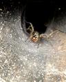
Welcome to My Lairby MarkS224Comment: Kinda cool tunnel the spider has built there. Nice focus on the spider, I'd love to see it being more dominant in the shot. Maybe cropping from the bottom and a bit from the top of the pic and turning it into a landscape?
Btw, since there's the hot discussion going on, I feel spiders are within the challenge guidelines and any score I give is purely based on the photo quality. Just thought I should add that. :) |
| Photographer found comment helpful. |
| 09/08/2003 06:38:30 PM |
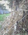
Charlotte's Webbby kim100878Comment: Spiders and spiderwebs are very hard to photograph IMO since the background has a tendency to intrude. This is happening here, too. There's too much background shining through and distracting, especially the blwong out sky in the top left. Overall the pic is quite bright. Also, I think it would be more appealing to actually see it from the side the spider is on to be able to see the spider better, but I suspect you weren't able to get there.
Btw, since there's the hot discussion going on, I feel spiders are within the challenge guidelines and any score I give is purely based on the photo quality. Just thought I should add that. :) |
| Photographer found comment helpful. |
| 09/08/2003 06:33:49 PM |
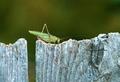
I love my grassby pitsamanComment: Hehehe, he seems to be hanging on so he won't fall off ;) Nice capture of a grasshopper. I always find it extremely difficult to (a) get close enough and (b) get a pic w/out lots of blades of grass in the front. You have mastered both, even though I'd love for the little blade in the bottom right not to be there, but it's not very distracting. Nice colors and lighting, and he seems to be looking right at you. Good job :) |
| Photographer found comment helpful. |
| 09/08/2003 06:26:18 PM |
buttrflyby pechkaComment: The photo's a bit on the small side, but not as small as others. At least I can still see details. I think you focused nicely and, even though your background is not OOF, it's very unobtrusive, which is nice. Maybe a tiny bit of an increase in saturation would be nice just to boosts colors a bit. And a slightly larger submission next time round :) |
| 09/08/2003 06:20:42 PM |
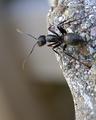
Cliffhangerby LanSnakeComment: Challenge met. Did you rotate the pic? I can't decide, but I guess it doesn't matter. Like the unobtrusive background, although, if the pic was not rotated, something that gives reference to where up is might have helped :) Anyhow, I think your technical execution lets you down here. There's really nothing in crisp focus and where the plane of focus seems to be the closest is where the ant's body is, not the head, which I personally would've preferred. |
| Photographer found comment helpful. |
| 09/08/2003 02:16:55 PM |
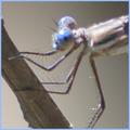
Big Baby Bluesby spidermanComment: You sure did get close up and personal ... maybe a bit too much. While the composition is nice, the technical execution lets you down ... something needs to be in focus, and with living creatures, it's usually the eyes. A little contrast enhancement could also improve the shot IMO. |
| 09/08/2003 11:46:36 AM |
On The Fenceby ewall53Comment: I think this would be quite a spectacular photo if we could see it at a reasonable size. This is way too small to judge ... you can size it up to 640 px on the longer side here. But I'm sure you are getting the comment plenty of times. From what I can see, I like the very uncluttered background and the old wood gives some nice additional texture. |
| Photographer found comment helpful. |
Home -
Challenges -
Community -
League -
Photos -
Cameras -
Lenses -
Learn -
Help -
Terms of Use -
Privacy -
Top ^
DPChallenge, and website content and design, Copyright © 2001-2026 Challenging Technologies, LLC.
All digital photo copyrights belong to the photographers and may not be used without permission.
Current Server Time: 07/17/2026 12:41:42 AM EDT.