| Image |
Comment |
| 05/24/2002 02:06:00 PM |
Solitareby PaulinaRDComment: I love solitaire! Trying to figure out which of the gazillion versions out there you are playing . . . Shot is nice and focused, I like the idea of cropping the edges of the cards to show that there's more than just what's visible, but I'm wondering if I wouldn't try to crop this shot even tighter, (maybe turn it into a portrait shot?) to get rid of more of the background. Just a thought. |
 Photographer found comment helpful. Photographer found comment helpful. |
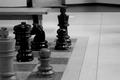
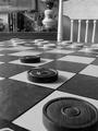
| 05/21/2002 01:22:00 PM |
Chess showdown at the mall.by tydComment: Great idea! Somehow, every time I look at this shot I try to scroll to see the top of the photo, and then realize that it's landscape and I already see the top. Have you tried doing this one in portrait format? WIth less of the mall floor on the right side but more background up top? Does that work? |
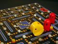
| 05/23/2002 12:03:00 PM |
Pac Attackby MaverickComment: I like the DOF and lighting. Also like that you show sufficient amounts of the board, but not everything. |
| Photographer found comment helpful. |
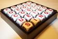
| 05/23/2002 12:02:00 PM |
Sin Is Inby ReubenComment: Good angle, focus (no pun intended) and DOF. If I had to take the shot, I would probably try a different background (even though it's not that noticeable, the pattern on the cloth is slightly distracting - try cardboard) and I would probably not arrange the letters as symmetrically. In fact, I would either have them fall random or just do one word that I felt was important for the challenge and leave the rest random. Small nitpicks, I know. |
| Photographer found comment helpful. |
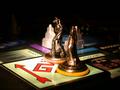
| 05/22/2002 07:47:00 AM |
Passing Go!by Susan2736Comment: I think a little more DOF (to bring both figures into focus) would have been nice here. |
| 05/23/2002 12:11:00 PM |
Eight ball corner pocket..by justineComment: I like the composition, but I think I would've preferred a little more DOF in the foreground (or crop out the first row of balls). Alternatively, add them in the back so that there's less of just blank background. |
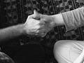
| 05/21/2002 02:45:00 PM |
Sunday Morning Thumb Wrestlingby lisaeComment: I'm wondering how this photo would've done in color (depending on what colors the background is, if it's very bright, then b&w probably is better. I just feel I would like to have something additional to hold my interest. Of course, that's just my opinion. I do like that you can see the movement on the thumbs. |
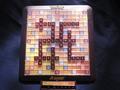
| 05/24/2002 02:44:00 PM |
Sweet Word Gameby YoodioComment: Now there's an incentive for long words if ever I saw one! I may implement this game variation at home! ;o) |
| 05/24/2002 02:38:00 PM |
rainy day pastimeby lecookComment: B&w works well here, love the angle, too. Somehow the lighting doesn't conjure up thoughts of rain, but who cares. I would've cropped a smidgen more off the top so that the little bit of black at the top of the chair wasn't there, but that's a very minor change. Good job! |
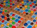
| 05/22/2002 09:43:00 AM |
Scrabbleby jimmspComment: Nice choice of words, very appropriate for this challenge. The letters on the tab are a little dark, and there is a hotspot in the top right of the board. I possible, I would try to shoot something like this with natural light, and see if that gets rid of it. |
Home -
Challenges -
Community -
League -
Photos -
Cameras -
Lenses -
Learn -
Help -
Terms of Use -
Privacy -
Top ^
DPChallenge, and website content and design, Copyright © 2001-2026 Challenging Technologies, LLC.
All digital photo copyrights belong to the photographers and may not be used without permission.
Current Server Time: 07/17/2026 07:31:36 AM EDT.