| Image |
Comment |
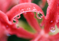
| 01/11/2009 12:23:22 PM |
Spider Lily '05by Pug-HComment: I think your crop and color adjustments work well, and shallow DOF is perfect; love the tiny details refracted in the water drop.
Compared to my camera, that's minimal grain, and in the soft OOF areas it is not a distraction at all for me -- I think people are usually way over-sensitive to it. |
 Photographer found comment helpful. Photographer found comment helpful. |
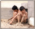
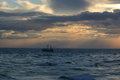
| 01/11/2009 12:18:16 PM |
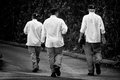
Beach-people-copy-Sand-boys.jpgby jomariComment: Nice transformation from what most would call a "snapshot" into a fine piece of candid portraiture. The border works pretty well; fits in with the concrete and sand. |
| Photographer found comment helpful. |
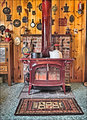
| 01/11/2009 12:15:02 PM |
Heatby HipychikComment: I don't know what that "topaz" adjustment does -- to me it gives everything a kind of bright, "hard" look, almost like it's a piece of glazed ceramic sculpture. I guess my experience with rustic, wood-paneled rooms like this has been where it's much dimmer lighting, with a softer, moody look.
You might consider using a perspective correction; near the sides (especially the left) there is a noticable slant to the vertical lines. |
| Photographer found comment helpful. |
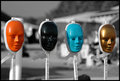
| 01/11/2009 12:08:22 PM |
Faces of Cancerby cryanComment: Good use of the selective desaturation technique. Too bad the melanoma mask wasn't twisted a bit towards you to get more light detail on the far side, but a powerfiul image anyway. |
| Photographer found comment helpful. |
| 01/11/2009 12:04:56 PM |
|
| Photographer found comment helpful. |
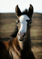
| 01/11/2009 12:00:15 PM |
APAW-2-Original-2027.jpgby PGerstComment: This reminds me a lot of an old photo of mine of a sunrise over Mt. Rainier (I have a print version posted). On that one, I made separate masks for ocean and sky and did tone (Curves) adjustments separately to bring out the color and contrast in the sky; see if you can bring out the patterns of the rays/beams. To my eye it might benefit from a slight CCW rotation. |
| Photographer found comment helpful. |
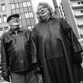
| 01/11/2009 11:55:46 AM |
Mr. and Mrs.by bvyComment: Good tone and contrast. I think the square crop and the angle work fine, especially with the the way his arm is parallel tot he edge. |
| Photographer found comment helpful. |
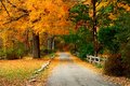
| 01/11/2009 11:53:25 AM |
Fall in West Cornwall (APAW-1)by PGerstComment: I think cropping the washed-out sky helps, though the verticality of the original helps draw one into the photo; however, the contrast between the trees and the path/fence/rock line-up work well enough to do the same. I definitely prefer the increased saturation in the new version -- nice rich color but not overdone. |
| Photographer found comment helpful. |
| 01/09/2009 03:46:01 PM |
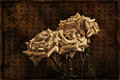
Paper Rosesby cginoComment: Very nice effect -- they look like antiques. The kanji text in the BG makes an interesting effect -- essentially a random abstract pattern to those of us who can't read it. |
| Photographer found comment helpful. |
| 01/09/2009 03:43:07 PM |
Chefsby RetroesqueComment: I like the vignette effect of isolating the subjects in the light ... just to be picky, if they all work in the same kitchen, they may all cook but only one can be "the chef." ;-)
How was the food? |
| Photographer found comment helpful. |
Home -
Challenges -
Community -
League -
Photos -
Cameras -
Lenses -
Learn -
Help -
Terms of Use -
Privacy -
Top ^
DPChallenge, and website content and design, Copyright © 2001-2026 Challenging Technologies, LLC.
All digital photo copyrights belong to the photographers and may not be used without permission.
Current Server Time: 06/19/2026 05:23:48 PM EDT.