| Image |
Comment |
| 01/28/2009 03:10:05 PM |
Week 3: Sunset on the Bayby tinky2Comment: Yup -- it's nice when it just needs minor color/tone adjustments to clear up the colors. Very pretty scene, well-done. |
 Photographer found comment helpful. Photographer found comment helpful. |
| 01/25/2009 02:16:44 PM |
Wadingby HipychikComment: A good crop, and a good job recreating the bright glare without losing detail in the water. |
| Photographer found comment helpful. |
| 01/25/2009 02:15:03 PM |
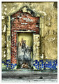
Any port in a storm #2by Yo_SpiffComment: I think I like this version the best, with the gritty drabness of urban decay offset by the bright fragments of tile recalling a more genteel past. |
| Photographer found comment helpful. |
| 01/25/2009 02:11:02 PM |
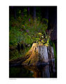
Week 2: Woodland Shoreby NeilComment: So how long did that spotlight effect on the stump last, and how long did you have to wait for it? Beautiful naturally-occuring still life. |
| Photographer found comment helpful. |
| 01/25/2009 02:07:39 PM |
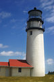
Highland Lighthouse (APAW-3)by PGerstComment: Originally posted by cgino:
Aren't you a brave sole to clone out that fence, I know how much work it is to do that and it is so much nicer without it! |
No kidding -- excellent job! I also prefer the color version, but that might depend on the viewing context -- the B&W is also a fine image, and there are many times when that would be the more appropriate version.
I think I've actually seen this lighthouse, though it would have been almost 30 years ago. |
| Photographer found comment helpful. |
| 01/25/2009 01:58:02 PM |
Sunset Fishing Boat (APAW-2)by PGerstComment: Very pretty -- I guess I like silhouettes taken against vibrant colors, and this is just about the amount I would push the saturation also ... :-) |
| Photographer found comment helpful. |
| 01/25/2009 01:50:34 PM |
Sunset Fishing Boat (APAW-2bw)by PGerstComment: Nice luminous quality to the water. I think I like the color version better, but I might feel differently on a different day ...
I think it's fine to have the horizon near the middle if you have important detail both above and below, as here. |
| Photographer found comment helpful. |
| 01/25/2009 12:41:47 PM |
Week 3: Heading Home At Sundownby lynnesiteComment: Well, 1/180 doesn't seem so "slow" to me, but whatever -- it certainly works well here. I like the white-on-white isolating the subject, along with the limited focus. Very nice portrait. |
| Photographer found comment helpful. |
| 01/25/2009 12:34:24 PM |
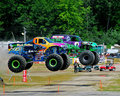
Monster-Trucks-055.jpgby cryanComment: I'm not a big fan of this hobby myself, but I appreciate the engineering ingenuity which goes into the creation of these machines.
For all that, this is a fine action shot, and one which shows off their power and grace and "athletic ability" rather than one mauling (crawling over) another, as I see so often in the TV ads for these events. Nice work!
Oh yeah, I love the juxtaposition of the monster trucks in the foreground with the "baby trucks" (golf carts) in the back. Message edited by author 2009-01-25 12:35:55. |
| Photographer found comment helpful. |
| 01/25/2009 12:26:18 PM |
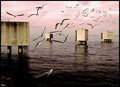
Sorrento-008-pp3.jpgby jomariComment: Of the three versions, I think I like this one the best -- I can really imagine being there myself and hearing the birds fly past. |
| Photographer found comment helpful. |
Home -
Challenges -
Community -
League -
Photos -
Cameras -
Lenses -
Learn -
Help -
Terms of Use -
Privacy -
Top ^
DPChallenge, and website content and design, Copyright © 2001-2026 Challenging Technologies, LLC.
All digital photo copyrights belong to the photographers and may not be used without permission.
Current Server Time: 06/19/2026 03:47:44 PM EDT.