| Image |
Comment |
| 04/18/2004 09:14:13 PM |
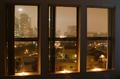
Looking Out at Los Angelesby mirdonamyComment: I like the triptych effect of this shot; but I think it's marred a bit by the loose blindes to the left of the center and left panels. I think if they were tucked over tightly against the sides of the windows the effect would be stronger. I like the lighting and mood; would probably look good in B+W as well. |
 Photographer found comment helpful. Photographer found comment helpful. |
| 04/04/2004 08:12:25 PM |
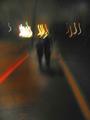
Friday Nightby choklat_thundrComment: At least on my monitor I find the brightest lights to be a little too bright, and take away from the overall mood. |
| 03/29/2004 12:59:00 AM |
|
| 03/25/2004 12:03:16 AM |
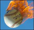
Slammin'by karmatComment: Originally posted by scalvert:
Good idea, but wouldn't the flames be trailing an [upward] moving ball? Just turn the ball upside down before shooting and rotate the image 180 degrees to get the effect. A low-speed fan on the flames would really give the impression of a meteor. |
If anything, I'd rotate it clockwise, so the flames trail horizontally. As someone pointed out, a common baseball term for a fastball is "heater." |
| Photographer found comment helpful. |
| 03/23/2004 01:21:58 AM |
Sea Levelby ChrisW123Comment: Beautiful interpretation of a "classic" image. This image would also take well to having "painting" filters run on it. |
| Photographer found comment helpful. |
| 03/16/2004 03:56:47 AM |
|
| Photographer found comment helpful. |
| 03/16/2004 03:53:33 AM |
|
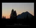
| 03/08/2004 07:34:25 PM |
Black Butte (8x10 ratio)by GeneralEComment: Why thank you both ... I use the larger borders sometimes to fill out the print size, so I don't have to resample the image and introduce any more noise or blurriness (I'm starting with less than 2MP). I figure people can trim/cover it if they don't like it, but someone can also just tack/tape it to the wall if they can't afford to frame it and have it look "finished."
This image was taken one-handed through the windshield, so I have no quality to spare .... |
| 03/08/2004 01:32:18 PM |
3... 2... 1...by GeneralEComment: Originally posted by ChrisW123:
General, you are tied with Jacko (Mudane challenge) for the Brown Ribbon reward. :) Did you do it on purpose like he did? |
No, it seems I can do this without trying! Too bad, I just missed getting two in a row.
I'm concerned that people may think I'm deliberately "thumbing my nose" at the challenge topic with an off-beat interpretation like this. Really, I am also trying to work within the the limits of the technology and time I have at hand. With my camera, I could have lit enough matches to smoke up the Los Angeles basin and never gotten a capture like the winning one. |
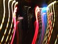
| 03/02/2004 01:31:05 AM |
Luv Da Yanx!by GeneralEComment: I guess I should have added my subtitle, "License Plate." I take a lot of pictures of personalized plates, so they are a pretty mundane object to me ... and I thought that the one rectangle among the light trails (and the colored trails themselves) was enough of a clue as to the main subject.
Interestingly, this is a transplanted baseball fan -- it was shot in California. |
Home -
Challenges -
Community -
League -
Photos -
Cameras -
Lenses -
Learn -
Help -
Terms of Use -
Privacy -
Top ^
DPChallenge, and website content and design, Copyright © 2001-2026 Challenging Technologies, LLC.
All digital photo copyrights belong to the photographers and may not be used without permission.
Current Server Time: 06/23/2026 10:08:51 AM EDT.