| Author | Thread |
|
|
03/18/2004 10:00:47 AM |
Critique Club
Composition
The composition is impressive. You included the fire hydrant for perspective, you have diagonal lines disappearing into one of the corners of the image and you captured the architectureal beauty and magnificence of this subject against a graduated backdrop of ever darkening sky. Artistic of you to see something like this and then be able to capture it to share with others. Because this was based on the Advanced Editing rules, however, I would like to see just a couple of changes to your composition. The large vertical column just above the fire hydrant has what appears to be a white sign on it (in the shaded area). I think it would enhance the photo to clone that out. Likewise under one of the spans of highway that runs almost horizontal you should be able to see what appears to be a traffic sign. I think the picture would benefit from having that cloned out as well. Those two things are minor nits and easily overlooked on first viewing of the photo though.
Color
The colors in this shot were kept to a minimum (probably by the designers of the interstate) but it works well for you because it allows the grace of the design to speak more powerfully. The organic orange hue seems to work well whether it is cast in full shade, sidelit or in direct sunlight. The yellow/orange of the hydrant is starkly lit against the shaded cement. The range of blue in the sky is a beautiful backdrop against which the scene can be set. The high-octane blue along the side of the interstate walls works in contrast to the muted orange and the darker blue in the upper left corner. The image contains few colors but they all receive ample space in the photo so that they help to create a beautiful scene. Rather than having blobs of color, the extended lines help reinforce the graceful concepts that went into this design.
Focus
You have ample depth of field here with your aperture of 9.0. I'm sure the amount of ambient light you had to work with helped you and I think that any smaller aperture would not have worked (see Lighting).
Lighting
My argument against a smaller aperture is that I think it may have resulted in shadows that were too dark to create the 3-tone effect that some of the roadway has; I think it would have tended to generate areas that were "in light" versus areas that were "shaded". With your capture you have produced 3 distinct ranges out of one color. The whole interstate seems to thrive off the bright orange hue on its surface but you have enhanced that by going when this section was in direct sunlight and you have further deepened the color by shooting at f/9 which allowed you to get brightly lit sections of the road as well as mildly lit ares and much deeper shadows. The shadow running down to the fire hydrant is also timed almost perfectly; it leads the eye down the photo to the hydrant.
Overall
This photo is a very strong shot given your title. You truly nailed what it looks like you were aiming for. It is abstract art from a view of an interstate roadway. Congrats to you for seeing it and noticing the beauty and balance inherent in this view and even more for being able to capture it and share with us. It is deserving of an award. This capture the essence of the design that others labored to produce; to me you got exactly what a photographer should look for: a replica that inspires its viewers in a similar manner to how the original view must have inspired you. |
|
 Photographer found comment helpful. Photographer found comment helpful. |
|
|
03/16/2004 09:53:12 AM |
|
Hey Richard, what's this? A ribbon-winning photo with your wife not in it? Wife or not, super work, as usual! |
|
| Photographer found comment helpful. |
|
|
03/16/2004 07:05:26 AM |
|
This is one of the very best images I've seen on DPCHALLENGE. Thank you. |
|
| Photographer found comment helpful. |
|
|
03/16/2004 03:56:47 AM |
|
Your ramps sure did better than mine have in the past -- congratulations! |
|
| Photographer found comment helpful. |
|
|
03/15/2004 04:14:41 PM |
Well done Richard - great photo - I dont know how anybody could give this a 1...but I still think you should get rid of that hydrant!!
Mike
|
|
| Photographer found comment helpful. |
|
|
03/15/2004 11:35:35 AM |
|
Congrats, and forget the "one," you deserved what you got. Well done! look at it this way, the "one" also puts you in good company with Jacko! |
|
| Photographer found comment helpful. |
|
|
03/15/2004 11:31:35 AM |
|
Congrats Richard. The usual awesome quality from you again. |
|
| Photographer found comment helpful. |
|
|
03/15/2004 08:50:23 AM |
|
Great one! The colors are awsone! :-) |
|
| Photographer found comment helpful. |
|
|
03/15/2004 07:15:44 AM |
|
Congratulations on the red ribbon, a powerful image. |
|
| Photographer found comment helpful. |
|
|
03/15/2004 05:23:39 AM |
Congratulations..well deserved ribbon.
Never noticed the hydrant originally and wondered why you hadn`t cropped the bottom slightly..which only goes to prove that I should have been looking harder.
Great work.
Gordon |
|
| Photographer found comment helpful. |
|
|
03/15/2004 02:32:27 AM |
Congratualtion on the ribbon!
I'm the one that noticed about the color which looks not really natural, BUT i'm not the one who gave you "1", of cource not... :D
Well deserved one.
|
|
| Photographer found comment helpful. |
|
|
03/15/2004 02:05:20 AM |
|
I thought it was a great shot. Then I saw the hydrant and actually said "wow!" out loud. It really gives you a great idea of how big the structure is. I'm glad you left the hydrant in! Congrats! |
|
| Photographer found comment helpful. |
|
|
03/15/2004 01:10:21 AM |
|
Very nice indeed... congrats on the ribbon. |
|
| Photographer found comment helpful. |
|
|
03/15/2004 12:56:57 AM |
Thanks everyone:)
This Interchange is indeed painted with blue and beige. I have a feeling the one person that was generous with the "one"..."1" I recieved may have felt I colored this in.....gotta laugh:)....I have the honor of having the only "one" in the top ten:)
thanks again to all that took the time to vote and comment.
Richard
|
|
|
|
03/15/2004 12:23:40 AM |
I see you used the hydrant for scale. Nice idea. Congrats on your Ribbon! RoB
Message edited by author 2004-03-15 00:23:55. |
|
| Photographer found comment helpful. |
Comments Made During the Challenge  |
|
|
03/14/2004 07:13:01 PM |
|
| Photographer found comment helpful. |
|
|
03/14/2004 10:39:59 AM |
|
The colors and shadows are excellent. I would have cloned out the tiny arrow on the bottom right though. Nice work |
|
| Photographer found comment helpful. |
|
|
03/14/2004 06:40:43 AM |
|
Interesting pattern and angle of your shot. I like the colors and the shadows add depth. A well don modernistic picture. |
|
| Photographer found comment helpful. |
|
|
03/14/2004 12:34:54 AM |
|
I wish the hydrant in the bottom right wasn't there. Otherwise great choose of shot. |
|
| Photographer found comment helpful. |
|
|
03/13/2004 08:24:18 PM |
|
I think I would have liked this more without the fireplug. It is a very good image however. |
|
| Photographer found comment helpful. |
|
|
03/13/2004 05:00:33 PM |
|
THis is really great...just two nits....lossing the hydrant and extend the shadow in the bottom right corner and, IMO, it would absolutely perfect! WOW! 10 despite the nits cause when I scroll up (or is it downLOL) I don't see them. |
|
| Photographer found comment helpful. |
|
|
03/13/2004 08:15:25 AM |
|
| Photographer found comment helpful. |
|
|
03/12/2004 11:49:11 PM |
|
| Photographer found comment helpful. |
|
|
03/12/2004 05:22:04 PM |
|
I love this one, The colors and lines are great! |
|
| Photographer found comment helpful. |
|
|
03/12/2004 07:59:35 AM |
|
stunningly simple and strong |
|
| Photographer found comment helpful. |
|
|
03/11/2004 06:30:17 PM |
|
Very nice angle, composition is well done...color and contrast are very nice...good job |
|
| Photographer found comment helpful. |
|
|
03/11/2004 12:43:51 AM |
|
I like this. It reminds me of those times I would want my parents to drive on all the different tracks because it looked so space-agish. |
|
| Photographer found comment helpful. |
|
|
03/10/2004 12:48:00 PM |
|
I even like the hydrant. Nice shot. |
|
| Photographer found comment helpful. |
|
|
03/10/2004 09:07:31 AM |
|
Nice colors ... is this kind of post processing legal in this competition? |
|
| Photographer found comment helpful. |
|
|
03/09/2004 03:59:55 PM |
|
Great shot and post treatments. This one may ribbon. |
|
| Photographer found comment helpful. |
|
|
03/09/2004 03:55:34 PM |
|
| Photographer found comment helpful. |
|
|
03/09/2004 03:28:00 PM |
|
What a great idea! You managed to take an everyday item and make it a work of design/engineering art, very well done. |
|
| Photographer found comment helpful. |
|
|
03/08/2004 09:07:46 PM |
|
Amazing colours... great take on the challenge excellent! |
|
| Photographer found comment helpful. |
|
|
03/08/2004 07:50:05 PM |
|
Works well all around for me. Nice! |
|
| Photographer found comment helpful. |
|
|
03/08/2004 05:27:33 PM |
|
This, of course, is excellent, right down to the fire hydrant. It's just a matter of "which ribbon." 10 |
|
| Photographer found comment helpful. |
|
|
03/08/2004 04:58:36 PM |
|
Very effective composition and colours and a wonderful interepretation of the challenge. Small points - if you have photo-editing software you could have got rid of vehicles (?) protruding above parapets and also fire hydrant (?) in lower right (or croped a bit higher). Excellent image overall. |
|
| Photographer found comment helpful. |
|
|
03/08/2004 03:45:26 PM |
|
Nearly a WOW photo, I love the form of the structure and the colours are outstanding, but...the object in the bottom right just spoils the overall impact a little. Nevertheless I am certain you will be placed quite high. |
|
| Photographer found comment helpful. |
|
|
03/08/2004 02:34:40 PM |
|
great color and exposure. nice blues. i like this one. |
|
| Photographer found comment helpful. |
|
|
03/08/2004 01:09:14 PM |
|
My top three.....very good. |
|
| Photographer found comment helpful. |
|
|
03/08/2004 01:00:57 PM |
|
| Photographer found comment helpful. |
|
|
03/08/2004 12:55:12 PM |
|
Man, too bad there is a shadow....this is a really strong image. But, I can't help but feel like the image is cut off at an angle. I tried to view it as a part of the composition, but my eye just gets pulled right to it. 7 |
|
| Photographer found comment helpful. |
|
|
03/08/2004 12:27:30 PM |
The colors and the clarity of this photo really grap you. Nice job. 7
|
|
| Photographer found comment helpful. |
|
|
03/08/2004 12:08:21 PM |
|
Oh... I really love this one. It's one of my favorites in this challenge. I love the colours and how you incorporated the design of the structure into the design of the photo with good composition. GOod luck! This is pitch perfect! |
|
| Photographer found comment helpful. |
|
|
03/08/2004 10:51:52 AM |
|
Great abstract. Hope this is not voted down much for being "unphotographic". To complete the surrealism of the composition I would have cloned out the fire hydrant, the two light spots to the left of the near upright and the light rectangle in the shadow at the bottom of the near upright. |
|
| Photographer found comment helpful. |
|
|
03/08/2004 09:16:46 AM |
|
great colors ... the shadow takes away a little bit, but not much ... well done |
|
| Photographer found comment helpful. |
|
|
03/08/2004 08:02:02 AM |
Nicely composed and very eyecatching colour ..a slight crop off the bottom is the only thing that would improve this for me.
Good work |
|
| Photographer found comment helpful. |
|
|
03/08/2004 06:30:55 AM |
|
Great image. Vivid colours. Fantastic control over design. 10 |
|
| Photographer found comment helpful. |
|
|
03/08/2004 12:22:27 AM |
|
Great color and contrast! |
|
| Photographer found comment helpful. |
Home -
Challenges -
Community -
League -
Photos -
Cameras -
Lenses -
Learn -
Help -
Terms of Use -
Privacy -
Top ^
DPChallenge, and website content and design, Copyright © 2001-2026 Challenging Technologies, LLC.
All digital photo copyrights belong to the photographers and may not be used without permission.
Current Server Time: 06/28/2026 12:19:28 PM EDT.


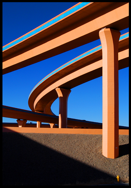
 Interstate Abstract


