| Image |
Comment |
| 06/13/2003 03:54:46 PM |
|
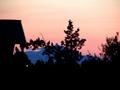
| 06/12/2003 07:00:02 PM |
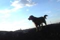
"DOG WORLD"by melissartsComment: Pretty sky...but the lighting on the dog isn't very complimentary, the partial silhouette shows a few of the dog's features, so it doesn't work as either a good look of the dog or a good silhouette. The sharpness seems low. Back to the lighting...the sun pretty much washed out the sky in that area. 5 Rob the Swash |
 Photographer found comment helpful. Photographer found comment helpful. |
| 06/12/2003 06:57:20 PM |
Fashionby TonesOfGrayComment: Nice shot for focus, but the lighting is very harsh on the model\'s chest, hand and leg. Nice angle approach. 6 Rob the Swash |
| 06/12/2003 06:54:56 PM |
Rubber Loverby ish36Comment: ???? I've never heard of that magazine (but I won't score you down for it). The pattern is nice, but the lack of sharpness hurts the overall image. Nice color and lack of hot glare spots. 6 Rob the Swash |
| 06/12/2003 06:53:29 PM |
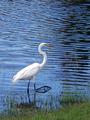
Wildlife Conservation....http://wcs.org/by GraciousComment: Beautiful shot! The bird seems a tad overly sharp, but I like this image so very much. Love the color. Nice amount of open spaces for type (nit, but worth commenting). A tad faster exposure might have stopped the leg motion. Still, I love this, so 10 - Rob the Swash |
| Photographer found comment helpful. |
| 06/12/2003 06:50:21 PM |
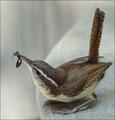
Bird Watcher's Digestby TerryGeeComment: Amazing photo!!! The wren looked almost wooden (but it's too good for that even). Even more incredible with the ant in it's beak. WOW!!! Great color, focus and I like the framing - but the square sizing might hurt your overall score (but not from me!!) 10 Rob the Swash |
| 06/12/2003 06:48:16 PM |
Great Break Timeby kposeyComment: This seems more like a picture of a magazine cover, rather than a picture FOR a magazine cover. Very clear, well taken photo. Good color. 5 Rob the Swash |
| 06/12/2003 06:46:33 PM |
In between somewhere..by Michael_Comment: Nice colors, but the trees seem pretty blurry. The title doesn't seem to be a magazine title, what mag were you "covering"? I just don't get it, sorry, my bad.
4 Rob the Swash |
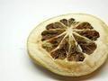
| 06/12/2003 06:44:39 PM |
Real Simpleby BeingCleverComment: Its a very good photo (though a bit less than appealing), but I don\'t get it. I\'ve never heard of Real Simple mag and I\'m not coming up with any mag title that would put this on their cover (Maybe a fruit drying mag?) The layout doesn\'t seem to lend itself to a cover shot, too (but I\'m not really scoring that issue). 4 Rob the Swash |
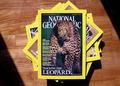
| 06/11/2003 03:28:21 PM |
National Geographicby ashwinComment: Lovely photo, but I think you missed the challenge idea - Make your OWN mag cover, not shoot somebody else's (this is other people's art - site rules and all)
4 Rob the Swash |
| Photographer found comment helpful. |
Home -
Challenges -
Community -
League -
Photos -
Cameras -
Lenses -
Learn -
Help -
Terms of Use -
Privacy -
Top ^
DPChallenge, and website content and design, Copyright © 2001-2026 Challenging Technologies, LLC.
All digital photo copyrights belong to the photographers and may not be used without permission.
Current Server Time: 07/27/2026 02:42:16 PM EDT.