| Image |
Comment |
| 07/11/2003 12:33:11 PM |
Many Questions - Few Answersby robsmithComment: Emotional shot, B&W seems very appropriate. It's fairly sharp, but the grain really impacts the image (was that on purpose?). Challenge met. 6 Rob the Swash |
 Photographer found comment helpful. Photographer found comment helpful. |
| 07/11/2003 12:12:56 PM |
Why?by johnmkComment: Nice portrait, good color. DOF seems too limited (so much of the face seems less than tack sharp). Looks a bit grainy, too. You might want to try different camera settings, start with the ISO as low as you can get it. These portrait shots are giving me trouble with the challenge, I guess I'm just not deep enough to understand the unanswered question from this. 6 Rob the Swash |
| Photographer found comment helpful. |
| 07/11/2003 12:10:03 PM |
Lost In Hereby marinajoeComment: Pretty model, but she isn't quite sharp, looks like the focus ended up on the water? I honestly don't get your title...and I'm having trouble seeing the question answered or not (challenge), but I have to assume this is just deeper than I am.
6 Rob the Swash |
| 07/11/2003 12:07:46 PM |
Just cruising along. Then....by MusicmanComment: Well composed shot, color seems pretty good, but maybe could use a touch more saturation. The shadows across the subjects tend to lessen the amount of detail. I'm not really getting the idea of a question answered or not, sorry, my bad. It also seems a touch grainy.. 5 Rob the Swash |
| Photographer found comment helpful. |
| 07/02/2003 06:25:41 PM |
Bug eyesby fleenkComment: Cool shot! Excellent color. Wierd looking catapillar. Score upgrade from 9 to 10. Rob the Swash |
| 07/02/2003 06:24:41 PM |
Little Boys and Baseballby draney4Comment: The clarity is good, but maybe a little over-sharpened. I'm guessing, but maybe this was cropped a little too much. 6 Rob the Swash |
| Photographer found comment helpful. |
| 07/02/2003 06:05:38 PM |
Buttercupby marboComment: The flower is wonderful. Being yellow on yellow is both a cool idea and a negative. The near parts of the flower are clear and distinct, but the farther parts blend into the similar colored background. Maybe a little more even lighting would have helped this. Score upgrade from 6 to 7. Rob the Swash |
| Photographer found comment helpful. |
| 07/02/2003 06:03:02 PM |
Dusk on Sydney Harbour Bridgeby ozdickComment: Very pretty color. Nice timing to catch the sun behind the Civic Center. I started this as a 6, it just didn't seem that clear on my first viewing, but looking at it longer, my appreciation has grown a bit. Something still "bugs" me, but I can't put my finger on it. Score upgrade to 8. Rob the Swash |
| Photographer found comment helpful. |
| 07/02/2003 05:59:14 PM |
behind blue eyeysby jbruno1397Comment: Good focus, but the lighting is just too harsh for my tastes. You might want to back off a little (if zoom capable) or use a different light source than your flash. 5 Rob the Swash |
| 07/02/2003 05:57:12 PM |
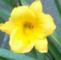
Bloom in the rainby Crafty SueComment: Lovely color...but the focus is not very good. It's a little tightly cropped on the left, the background seems like cement?? The grain on the leaves and background is a bit harsh, too. 4 Rob the Swash |
| Photographer found comment helpful. |
Home -
Challenges -
Community -
League -
Photos -
Cameras -
Lenses -
Learn -
Help -
Terms of Use -
Privacy -
Top ^
DPChallenge, and website content and design, Copyright © 2001-2026 Challenging Technologies, LLC.
All digital photo copyrights belong to the photographers and may not be used without permission.
Current Server Time: 07/27/2026 07:46:59 AM EDT.