| Author | Thread |
Comments Made During the Challenge  |
|
|
07/06/2003 05:49:02 PM |
|
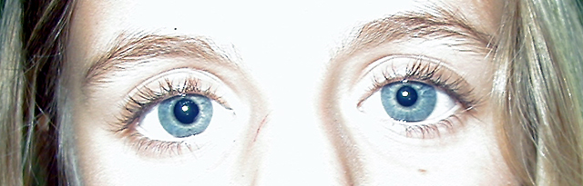
Penetrating eyes! A bit high key for saturated blues of the eyes. |
|
|
|
07/06/2003 04:31:35 PM |
|
Maybe it's me but I can't tel if you were going for a high key effect or not. |
|
|
|
07/05/2003 11:09:46 AM |
|
Quite overexposed - the blues could be more saturated. Interesting idea. |
|
|
|
07/04/2003 07:19:13 PM |
|
Way too washed out...too much flash...little tissue over the flash might help. thanks |
|
|
|
07/03/2003 11:59:01 AM |
|
For this type of lighting, I really would have liked to seen this back some and maybe off at an angle? Alot of blown out areas that draw attention more than the eyes do , which should be the emphasis. How did one pupil end up at about 5mm and the other at 3mm? (sorry RN coming out.) |
|
|
|
07/03/2003 09:14:32 AM |
|
Way too bright for my liking. |
|
|
|
07/03/2003 02:48:13 AM |
|
Over-edited. Cropped way down. Overexposed. |
|
|
|
07/03/2003 12:21:25 AM |
|
It seems way too overexposed between the eyes and on the forehead. Were you using a flash? |
|
|
|
07/02/2003 05:59:14 PM |
|
Good focus, but the lighting is just too harsh for my tastes. You might want to back off a little (if zoom capable) or use a different light source than your flash. 5 Rob the Swash |
|
|
|
07/02/2003 07:53:45 AM |
|
It's probably been said before but the lighting has totally blown the detail around the eyes. |
|
|
|
06/30/2003 12:52:43 PM |
|
Light is a bit harsh, but you'v pulled off the idea. |
|
|
|
06/30/2003 11:42:20 AM |
|
Good idea, but the bleached skin and sharpening artifacts detract |
|
|
|
06/30/2003 04:28:53 AM |
|
too bright. did you put the eyes that close together, or is that real |
|
|
|
06/30/2003 12:33:43 AM |
|
ouch over exposed and strange looking because of it.. also she looks as if she's looking at the camera (and thus slightly cross eyed) and fuzzy sorry I have to give it a 3 |
|
|
|
06/30/2003 12:23:44 AM |
|
you are too washed out in close the nose the left side is the worst as the skin and the whites of your eyes just blend together there is no seperation of color |
|
Home -
Challenges -
Community -
League -
Photos -
Cameras -
Lenses -
Learn -
Help -
Terms of Use -
Privacy -
Top ^
DPChallenge, and website content and design, Copyright © 2001-2026 Challenging Technologies, LLC.
All digital photo copyrights belong to the photographers and may not be used without permission.
Current Server Time: 06/28/2026 11:30:08 PM EDT.