| Image |
Comment |
| 05/13/2006 04:41:32 PM |
Purpleby electinaComment: From the Critique Club:
First of all let me point out that while I don't truly appreciate abstract photography, I do understand it's draw. That said let's see what we can come up with for a critique.
In this example, you have some awesome lines first off. They drive your eye right to the center bottom of the shot. All the lines lead there and that is a difficult task to achieve! You also have some incredible colors. I love the reds and contrasting yellows.
Now the hard part. While you have incredible lines that lead your eye, the spot that they lead you to is somewhat dissappointing. True there is a texture and color contrast at the 'focal' point but that isn't enough to keep the eye focused or interested. The focal point also isn't truly in focus. This is very distracting. I keep trying to force my eyes out of focus to make something focus in the shot. It doesn't work and is too much work for the viewer. Now if it were even more out of focus that might work, but I don't know what that would do to the background lines... There is a blown out area to the bottom right of the shot. This area just doesn't work. I don't think you could crop it out effectively. I also don't think that burning it would work either. This is simply an overexposure problem that would have to be fixed in camera. There is a bud (not the right term, but I'm not a botonist) sticking up just a bit in the bottom center of the shot. That is also a distraction to your simple composition here. That is something that COULD be cropped out easily enough.
Like I said in prefacing these comments, while abstract is not one of my favorite types of shots, I can appreciate a good one. You have a good eye for that type of thing it looks like. Just practice a bit more and I think you can come up with some AWESOME abstracts if that's your thing.
Yours
TC |
 Photographer found comment helpful. Photographer found comment helpful. |
| 05/13/2006 11:46:07 AM |
Little Red Takes Down Her Wulf!by chesireComment: From the Critique Club:
This shot just begs for the what I like what I don't like treatment so that's how we're gonna go...
What I like: I love the little girls facial expressions! I don't know if she's hammin' it up for the camera or if she's having a ball playing with Dad(?) but it works very well. Love Dad's look of adoration. Love the natural poses of the two subjects. This takes what would normally be considered a snapshot up a level with the emotions portrayed.
What I don't like: Your notes say that this was taken around 11 AM. This is a very difficult time to shoot a shot like this because of the naturally high contrast lighting. You can see this here with the very bright lawn just behind the subjects. This bright spot in an otherwise dully toned shot is very distracting and pulls the eye away. The overall tonality of the shot is also a little dull. There are a couple of ways this could be fixed. The first thing I would try would be to burn the highlights on the lawn. This would make the overall contrast a little dull but this could then be fixed with levels. Levels would also make her dress and his shirt a little brighter which I believe would be an improvement. Another thing that could be attempted would be using the flash to bring in a little fill light. I know this is a bit counter intuitive on a brightly lit day like this but this is a great use for even on board flash.
Overall this is a neat shot. I believe that improving the contrast and taking out the hotter spot in the lawn would improve this a lot.
Hope this helps
TC |
| Photographer found comment helpful. |
| 05/13/2006 10:42:12 AM |
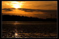
Urban Sunsetby DimyComment: From the Critique Club:
This shot looks like it could have a lot of potential. You have some very cool lines. I like the way the sun isn't centered like in many sunset shots. You do have some nice tones. But, it's got some issues that I think effected the scoring in this challenge.
First thing I would have to say mirrors several of your comments during challeng. It's way to dark. My eye is begging for detail that has been clipped out from the shadow detail. It appears that there is a road or bridge in the center of the shot that you can't see for sure. The foreground appears to be water but according to your description is the wet sea bed. This just needs the detail that I know is there but you can not see. Oh and just for the record, my monitor is calibrated pretty well.
Sunset shots, like any other type of shot needs to have a subject. A sunset by itself is more like a landscape. Unless it's a very STRONG sunset it doesn't act as the subject. It needs something else to let your eye land upon. There isn't anything here to achieve that goal.
Sunset shots are done all the time for challenges here at DPC. They tend to not score as well as some shots because they are done all the time. In order for a sunset type shot to score well it has to be exceptional in some way. This shot really isn't all that exceptional except for it's darkness. I would love to see the original of this to see what detail is really there!
TC |
| Photographer found comment helpful. |
| 05/12/2006 05:56:27 PM |
Devil's Poker Clubby Mr_BondComment: Very nicely done! The placement of the face looks a little off to me though. Like it SHOULD be more centered (just the way it feels to me...) You're also a little tight at the top and bottom. Where's the title and all the crap they have to put on the poster gonna go?
TC |
| Photographer found comment helpful. |
| 05/12/2006 05:55:03 PM |
Doomsday Prophet Countdownby StagoleeComment: Not a bad movie poster. You even have the right orientation! You need a little more room somewhere though for the title and all the crap they have to put on a movie poster...
TC |
| Photographer found comment helpful. |
| 05/11/2006 10:43:23 PM |
|
| Photographer found comment helpful. |
| 05/11/2006 10:42:35 PM |
Destination paradise castleby OdieComment: Very nice as a movie poster. You have room for title at bottom OR top and you have plenty of room at the bottom either way for all the other text crap they put on those posters.
TC |
| Photographer found comment helpful. |
| 05/11/2006 10:39:15 PM |
|
| Photographer found comment helpful. |
| 05/11/2006 10:37:19 PM |
|
| Photographer found comment helpful. |
| 05/11/2006 10:31:09 PM |
Driven Past Crazyby JutildaComment: Nicely done but a poster type orientation (crop) would make this a slightly better score...
TC |
| Photographer found comment helpful. |
Home -
Challenges -
Community -
League -
Photos -
Cameras -
Lenses -
Learn -
Help -
Terms of Use -
Privacy -
Top ^
DPChallenge, and website content and design, Copyright © 2001-2025 Challenging Technologies, LLC.
All digital photo copyrights belong to the photographers and may not be used without permission.
Current Server Time: 08/26/2025 05:40:05 AM EDT.