| Image |
Comment |
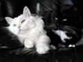
| 05/12/2004 07:31:29 AM |
Black and Whiteby artvetComment: Ooh, I like this a lot except that the black kitty gets lost against the dark background. Is there anything that can be done with lighting to bring him out a little more? Otherwise, I love the way they are "posed", particularly the white cat and they're eyes being the only color in the shot is neat since (I assume) this is a natural phenomenon and not a trick of post processing. |
 Photographer found comment helpful. Photographer found comment helpful. |
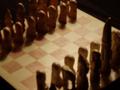
| 05/12/2004 07:26:52 AM |
chessmenby MorbidAngelComment: If the lack of focus is intentional, it doesn't work at all, I'm afraid. Also, I think the idea of using a chess game to illustrate opposites is a good idea, but it might be more effective if the pieces were the more traditional black & white kind to bring the point home. The similar colors of the pieces and the shadows don't illustrate the theme as well as if there were more stark contrast. |
| Photographer found comment helpful. |
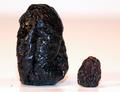
| 04/28/2004 08:39:16 AM |
Nature's Proportional Fruit - The Prune 'n Raisinby DrakeComment: Cute, but your lighting is off and there is stuff on the tabletop that is distracting. I'm not quite sure what to suggest to improve the lighting, but it just doesn't seem to make the fruit pop out right. |
| Photographer found comment helpful. |
| 04/28/2004 08:17:21 AM |
Small lightby Polar7Comment: Your photo matches the theme, but it lacks interest. The lighting in the background is too bright and washes out the detail of the paneling and the spacing of the objects doesn't feel right. This seems more or less a simple snapshot of two household items than an artistic interpretation of the challenge. |
| Photographer found comment helpful. |
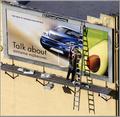
| 04/28/2004 08:14:20 AM |
Transitionsby garrywhite2Comment: This is a great illustration of the challenge theme! I like just about everything about it. It would have been nice if the worker were a little brighter--he gets a tad lost in the color of the billboard, but other than that, I think it's a great shot. |
| Photographer found comment helpful. |
| 04/28/2004 08:11:55 AM |
25 OZS Shortby Rando D300Comment: The Malibu bottle is too far to the right, making the shot feel unbalanced. I think you might have been better not cropping off the bottom of the bottles quite so much. |
| Photographer found comment helpful. |
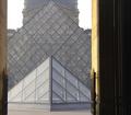
| 04/28/2004 08:07:19 AM |
Louvre Pyramidsby chinkenminComment: I think in this particular case, cropping to center the focal point would have been more effective. Nice interpretation of the challenge. |
| Photographer found comment helpful. |
| 04/28/2004 08:05:57 AM |
A Small Space and Lots of Cowsby LN13Comment: The photo doesn't really convey a feeling of a "small space" as your title suggests. In fact, the house being small in the distance and the many trees in the background give a sense of vastness for me. Challenge theme notwithstanding, the picture itself is too small to really be able to critque effectively. |
| Photographer found comment helpful. |
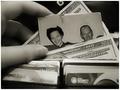
| 04/21/2004 08:28:01 AM |
A Forgotten Treasure Becomes a Lesson in Prioritiesby mocabelaComment: I love that you took a different point of view regarding the money theme. Finding a family picture within the bills is a nice change from the many shots showing money found in books or gardening or whatever. Not only is the theme nice, but I also like the quality of the photo itself. The composition, depth of field, sepia, lighting...all very nice. One of my favorites. |
| Photographer found comment helpful. |
| 04/07/2004 09:08:22 AM |
free will, you have it, use itby neilmwilsonComment: Love the concept, but the sand as a backdrop lessens the appeal. Maybe if you could have shot from below the wheels towards a bright blue sky...? Also, the middle wheel should not be cropped off at the bottom of the stick. |
| Photographer found comment helpful. |
Home -
Challenges -
Community -
League -
Photos -
Cameras -
Lenses -
Learn -
Help -
Terms of Use -
Privacy -
Top ^
DPChallenge, and website content and design, Copyright © 2001-2025 Challenging Technologies, LLC.
All digital photo copyrights belong to the photographers and may not be used without permission.
Current Server Time: 08/04/2025 08:10:36 PM EDT.