| Author | Thread |
Comments Made During the Challenge  |
|
|
05/04/2004 10:41:13 PM |
|
 Photographer found comment helpful. Photographer found comment helpful. |
|
|
05/04/2004 11:32:59 AM |
|
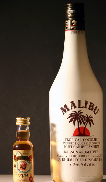
Nice picture, however, I think that better cropping would've helped. I don't like the fact that the bottom of the bottles are cut off. 5 |
|
| Photographer found comment helpful. |
|
|
05/04/2004 03:20:12 AM |
nice Snap ..
Maybe U could have includeed the shadows also .. U know .. Show the proportion between the shadows also !!! |
|
| Photographer found comment helpful. |
|
|
05/04/2004 12:36:15 AM |
|
the frame is too tight, letting the subject fill the frame is fine but why cut the subject off? |
|
| Photographer found comment helpful. |
|
|
04/30/2004 10:43:39 AM |
|
At least is shows proportion, but too easy. |
|
| Photographer found comment helpful. |
|
|
04/28/2004 08:59:11 PM |
|
This is a nicely lit shot, I'll give it that. It could be my imagination but the horizon line looks a bit off-kilter. I'm bothered that the bottom of the bottles got cut off. I think this would have made a stronger statement if the labels were the same. |
|
| Photographer found comment helpful. |
|
|
04/28/2004 08:02:58 PM |
|
I think you should have showed more of the bottom of the bottles. Seems uncentered. Good lighting, however. |
|
| Photographer found comment helpful. |
|
|
04/28/2004 07:11:47 PM |
|
| Photographer found comment helpful. |
|
|
04/28/2004 04:53:08 PM |
|
cropping is a bit tight on the bottom of both bottles, I like the reflection of one bottle on the other (creative lighting!) |
|
| Photographer found comment helpful. |
|
|
04/28/2004 10:27:45 AM |
|
Would be better if the same bottle or at least simular if not the same brand. |
|
| Photographer found comment helpful. |
|
|
04/28/2004 08:11:55 AM |
|
The Malibu bottle is too far to the right, making the shot feel unbalanced. I think you might have been better not cropping off the bottom of the bottles quite so much. |
|
| Photographer found comment helpful. |
Home -
Challenges -
Community -
League -
Photos -
Cameras -
Lenses -
Learn -
Help -
Terms of Use -
Privacy -
Top ^
DPChallenge, and website content and design, Copyright © 2001-2026 Challenging Technologies, LLC.
All digital photo copyrights belong to the photographers and may not be used without permission.
Current Server Time: 06/29/2026 01:39:20 AM EDT.