| Image |
Comment |
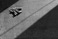
| 04/28/2005 02:27:17 PM |
keysby frogletComment: Great choice of lighting. I feel like I'm in a prison trying to figure out a way to get the keys |
 Photographer found comment helpful. Photographer found comment helpful. |
| 04/28/2005 02:26:32 PM |
|
| Photographer found comment helpful. |
| 04/28/2005 02:21:44 PM |
|
| Photographer found comment helpful. |
| 04/28/2005 02:21:14 PM |
Springtimeby Tom_RobbrechtComment: Nice capture of the flower. However it facing to the left never brings the eye to the right of the picture. The clouds help, but a portrait crop with the flower in the bottom right might have been a better choice. |
| Photographer found comment helpful. |
| 04/28/2005 02:03:11 PM |
Daylight Moonby zarniwoopComment: The moon is too soft in the image. I feel more like I'm looking at just a plain blue rectangle. |
| Photographer found comment helpful. |
| 04/28/2005 02:02:19 PM |
Full Moon and a New Pope.by docpjvComment: A slight bit of a turn of the camera, so that the cross and moon did not overlap would have greatly benefited the image. |
| Photographer found comment helpful. |
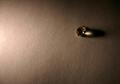
| 04/28/2005 02:00:09 PM |
The Lost Jewelby LongComment: The lighting choice does not fit the subject. There jewel feels out of place, and the focus is too much toward the right edge of the picture. |
| Photographer found comment helpful. |
| 04/28/2005 01:58:48 PM |
Broken full moonby ThorrComment: The line through the moon is distracting. Also the moon could use some more detail. |
| Photographer found comment helpful. |
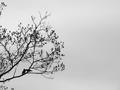
| 04/28/2005 01:57:36 PM |
Want to go back to my place?by ladpupmoeComment: The kissing birds is a very good accent to this picture. The background could have benefited from a more uniform tone. There appears to be too dark of a grey on the right side. Also a little bit more cropping on the left to remove those upper branches would be beneficial. |
| Photographer found comment helpful. |
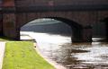
| 04/28/2005 01:54:16 PM |
Moor Hen on Bank of Canelby benhurComment: There is a glare in the top that seems to bleach the bridge. Also this appears to have been too cropped from a larger image and pixelated |
| Photographer found comment helpful. |
Home -
Challenges -
Community -
League -
Photos -
Cameras -
Lenses -
Learn -
Help -
Terms of Use -
Privacy -
Top ^
DPChallenge, and website content and design, Copyright © 2001-2025 Challenging Technologies, LLC.
All digital photo copyrights belong to the photographers and may not be used without permission.
Current Server Time: 08/04/2025 05:57:44 PM EDT.