| Image |
Comment |
| 11/24/2007 12:37:27 AM |
The Hustlerby keibo84Comment: I like this imagine! It's a little dark though-I would have brightened it up and boosted the contrast a bit (I think you can still do that in basic editing?). The look on the guy's face is great though, and it's beautiful image. |
 Photographer found comment helpful. Photographer found comment helpful. |
| 11/24/2007 12:27:37 AM |
|
| Photographer found comment helpful. |
| 11/24/2007 12:26:40 AM |
Buried in a Good Bookby jacqui_513Comment: I like this shot! It might have been a little more effective in color. And of course being in focus always helps. Great idea though! |
| Photographer found comment helpful. |
| 11/24/2007 12:26:05 AM |
|
| Photographer found comment helpful. |
| 11/24/2007 12:20:05 AM |
|
| Photographer found comment helpful. |
| 11/24/2007 12:18:53 AM |
|
| Photographer found comment helpful. |
| 11/24/2007 12:18:02 AM |
|
| Photographer found comment helpful. |
| 11/14/2007 05:46:51 PM |
|
| Photographer found comment helpful. |
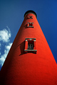
| 11/14/2007 05:21:58 PM |
Missing the light !by LuguerComment: I like this image, especially the colors. What I don't like is the near perfect centering and symmetry. The only things that make it interesting (besides the color) are the clouds on the left, and the shadows. Again, this splits the image neatly in half. What if you had shifted the lighthouse to the right side of the image? I do like the nearly "straight up" perspective. |
| Photographer found comment helpful. |
| 11/14/2007 04:59:58 PM |
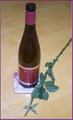
topless or is it to much drinkby ThaiComment: Interesting idea-a little cliche with the wine and rose (like something you'd buy in a poster shop). I do like the layout with the vertical bottle and diagonal rose stem. I'm not sure about A) the flash/bright light used-it's over exposed and B) the angle at which you shot. Is there a purpose to to it? It would have been more effective to shoot down at the same level as the subjects-instead the image appears flattened and smaller. The excessive flash also eliminated any possibility of a shadow, so the image appears very 1 dimentional. |
| Photographer found comment helpful. |
Home -
Challenges -
Community -
League -
Photos -
Cameras -
Lenses -
Learn -
Help -
Terms of Use -
Privacy -
Top ^
DPChallenge, and website content and design, Copyright © 2001-2025 Challenging Technologies, LLC.
All digital photo copyrights belong to the photographers and may not be used without permission.
Current Server Time: 09/03/2025 10:37:45 AM EDT.