| Author | Thread |
Comments Made During the Challenge  |
|
|
11/20/2007 05:54:48 PM |
Meets Challenge - 2
Technicality - 1
Creativity - 1
Biased Opinion - 0 |
|
|
|
11/20/2007 04:07:35 PM |
|
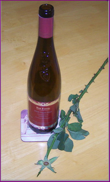
Not a fan of the lighting; the specular highlights on the bottle. Two subjects as well... would have been better to do one or the other |
|
|
|
11/20/2007 03:39:16 PM |
|
Good idea, but asks for a better background (IMHO) |
|
|
|
11/20/2007 01:06:54 PM |
|
not a bad concept, but the harsh lighting and the angle of the perspective really dont work for me here |
|
|
|
11/19/2007 01:07:52 AM |
|
|
|
11/18/2007 05:58:09 PM |
Boring photo, title is nonsense and doesn't help the photo in terms of interest to the viewer.
Purple border = what were you thinking
Coaster = what were you thinking
Floorboard = what were you thinking.
Adjust color and lighting |
|
|
|
11/18/2007 10:14:10 AM |
|
A little more thought to lighting would have helped.. It's too undefined and harsh.. and maybe working with one idea would also be better.. either the flower or the bottle.. both don't click together.. |
|
 Photographer found comment helpful. Photographer found comment helpful. |
|
|
11/17/2007 12:41:17 PM |
|
beware the camera-mounted flash... they tend to give too much glare and leave photo looking flat. Try shooting more from tabletop level without flash but indirect lighting from the sides. Good try! |
|
| Photographer found comment helpful. |
|
|
11/16/2007 05:42:17 PM |
|
Lighting seems harsh and I'm not fond of the uneven grey portion of the border. |
|
|
|
11/16/2007 03:54:21 PM |
|
no spark...no appeal...no top! |
|
|
|
11/16/2007 01:43:48 PM |
|
Interesting concept, although I personally dont' care for this angle. The image also seems a bit flat to me. One thing you can try is use poster board on either side of the bottle to get even reflections, and then use one with a whole cut out for your lense in the front. I am wondering if it would have worked better with the stem in the bottle? Hmm, well try to boost the saturation ext time and a touch of levels to help make it pop. |
|
| Photographer found comment helpful. |
|
|
11/16/2007 10:01:18 AM |
|
Lighting seems a little harsh, and the composition isnt really apealing to me. I think Because you shot down on your subject, the photo kind of loses it for me. |
|
|
|
11/15/2007 08:39:29 PM |
|
Nice idea, but the lighten could use a little work. |
|
|
|
11/15/2007 06:33:28 PM |
|
The color sucks, and it looks like you used built in flash,[cause the lighting sucks] no contrast, and it looks like an eBay pic. |
|
|
|
11/15/2007 04:24:18 PM |
|
You are onto a good idea here, i think. using what you have i would make a couple of suggestions. first, get a lower perspective. this perspective makes the bottle feel small, and i feel as if i am simply standing and looking down on it. a lower perspective would help the bottle to fill the frame more and give it more "importance" or at least a feeling of more importance. Secondly, the lighting feels a bit off. It almost feels like a flash was used, but you are missing the shadows (which is a good thing). Covering your lights with a soft cloth may help you to diffuse them more. Also, this gives the feeling of being dramatic (not quite romantic) so don't perhaps a darker shot would be more effective. Lose the coaster, it looks completely out of place. The woodgrain of the surface gives it a casual look. Putting down a piece of fabric would give it a more uniform look, and would solve the problem of needing a coaster. Also, you could choose whatever color you want. The are of the shot isn't large, so you could even use a t-shirt or something. Again, you've got a good idea, and the topless theme is repeated throughout the shot, which is good, but the execution of the shot makes it leave a bit to be desire. |
|
|
|
11/14/2007 04:59:58 PM |
|
Interesting idea-a little cliche with the wine and rose (like something you'd buy in a poster shop). I do like the layout with the vertical bottle and diagonal rose stem. I'm not sure about A) the flash/bright light used-it's over exposed and B) the angle at which you shot. Is there a purpose to to it? It would have been more effective to shoot down at the same level as the subjects-instead the image appears flattened and smaller. The excessive flash also eliminated any possibility of a shadow, so the image appears very 1 dimentional. |
|
| Photographer found comment helpful. |
|
|
11/14/2007 01:06:33 PM |
|
the lighting is really harsh |
|
| Photographer found comment helpful. |
|
|
11/14/2007 07:33:10 AM |
|
Interesting concept, but I think it could be improved by using a softer lightsource and a lower point of view (4) |
|
| Photographer found comment helpful. |
|
|
11/14/2007 06:32:22 AM |
|
light is way too harsh...reflection is distracting...next time, take the image FIRST, then drink the wine :-) |
|
| Photographer found comment helpful. |
Home -
Challenges -
Community -
League -
Photos -
Cameras -
Lenses -
Learn -
Help -
Terms of Use -
Privacy -
Top ^
DPChallenge, and website content and design, Copyright © 2001-2026 Challenging Technologies, LLC.
All digital photo copyrights belong to the photographers and may not be used without permission.
Current Server Time: 06/30/2026 11:33:56 AM EDT.