| Image |
Comment |
| 12/01/2003 12:23:27 PM |
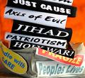
Black & White(thinking) & Red (causes suffering) all overby vrphotosComment: Critique Club:
A powerful piece of propaganda... although my own take on this picture is one of awareness rather than propaganda! The line is very fine, and maybe depends on whether you believe it or not. Any political advertising you don't believe in can be called propaganda I guess.
Anyway... the idea is a good one. A complex argument is simplified into a hard hitting image. I like the fact that the pro-war sound bites are in black and white, symbolic of the way that the pro-war contingency seemed to perceive the situation. The fragile parcel was a superb idea, a clever way of putting across the fact that the war was not in people's best interests. The 'Handle with care' sticker strongly implies that the opposite was in fact true. The picture really carries across the obsessiveness with looking at the pro-war arguments without considering the whole picture.
As far as the photography goes, the picture doesn't have quite enough attention to detail for my taste. For example, I'd have liked the background a smooth orange with no shadows and distracting detail.
Also, the edges of the paper used for the pro-war slogans seem a little sloppy. The highlights seem a little burnt out at the bottom right of the frame. A point that irks me about the photo is that I can't tell what the pro-war slogans are... are they books? The problem here is that they don't automatically convey weight to me. Could this have been solved by using a cartoon-like weight with the slogans on?
The base that the parcel is resting on also seems out of place. It really needs a smooth, non-distracting texture.
In conclusion, an inspired idea, a great piece of propaganda which just needs a little more polish. I personally wasn't sure about your title which seems rather unwieldy. Message edited by author 2003-12-01 12:25:30. |
 Photographer found comment helpful. Photographer found comment helpful. |
| 11/19/2003 04:49:45 AM |
|
| Photographer found comment helpful. |
| 11/12/2003 09:53:55 PM |
|
| Photographer found comment helpful. |
| 11/12/2003 07:09:06 AM |
|
| Photographer found comment helpful. |
| 11/11/2003 11:04:55 AM |
Still Lifeby MichaelsComment: Wonderful shot, everything is so right in this photo. Gorgeous green, great composition, nice use of negative space. I love the round leaves. The white background works brilliantly. 10 |
| Photographer found comment helpful. |
| 11/11/2003 11:02:05 AM |
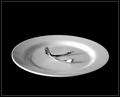
Wish Boneby JackoComment: A seemingly simple shot, captured perfectly. The reflections in the plate work well. The range of tones and exposure are perfect. The lighting is just right. The only thing I would criticise is the amount of negative space, which doesn't quite work for me. 9 |
| Photographer found comment helpful. |
| 11/11/2003 10:59:59 AM |
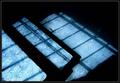
brokenby JasperComment: Creative shot, very imaginative high-key picture. Refracted light always seems to do well here at DPC, so I expect to see this score highly. Interesting juxtaposition of straight lines and curves. The splash of blue works nicely. 9 |
| Photographer found comment helpful. |
| 11/11/2003 10:19:35 AM |
When every day is the sameby i_skyComment: Intriguing abstract... I don't 'get' how the title matches the picture, but I very much like the composition, textures and colours. It's a little bit of a stretch from 'still life' in my book for an 8+ score. However, score: 7 |
| Photographer found comment helpful. |
| 11/11/2003 09:00:17 AM |
Just Add Breathby KoriyamaComment: Bravo! I'm guessing you used a projector... now I want one for all my instrument shots! I really would have prefered the top-left to bottom-right diagonal though, the one you chose always seems to jar with me. I think the border needs to be a bit more subtle... a good border never draws attention away from what it's framing IMO.The hue is just a little too yellow-orange for my taste, and looks just a little like the wrong white balance was used. However, I love this photo... and now desperately want to copy it! 9 |
| Photographer found comment helpful. |
| 11/11/2003 08:49:44 AM |
ROSE & BUDSby pookey83Comment: Wonderful subtle colours and tones captured here. I feel that the composition lets it down though... the ratio of negative space to subject seems haphazard and not thought out. Perhaps a tighter crop? 8 |
| Photographer found comment helpful. |
Home -
Challenges -
Community -
League -
Photos -
Cameras -
Lenses -
Learn -
Help -
Terms of Use -
Privacy -
Top ^
DPChallenge, and website content and design, Copyright © 2001-2025 Challenging Technologies, LLC.
All digital photo copyrights belong to the photographers and may not be used without permission.
Current Server Time: 06/27/2025 08:56:25 PM EDT.