| Image |
Comment |
| 05/19/2004 05:29:51 AM |
In the center of the attentionby asijComment: Not really in the centre... especially when you consider the main point of focus is the red light at the top of the building. Picture is very noisy, which could have been fixed with NeatImage. Not really sure what you were trying to achieve with this picture. |
 Photographer found comment helpful. Photographer found comment helpful. |
| 05/19/2004 05:28:15 AM |
Open Soonby dsidwellComment: Stunning picture, but the levels look a bit strange to me. I'd love to have seen the colour original. Colour would also help the background from not blending into the foreground subject in places. I think plenty of dodging and burning is required here... there's plenty of shadow detail in your subject to be rescued, and the background needs to be darker in places. |
| Photographer found comment helpful. |
| 05/19/2004 05:25:39 AM |
|
| Photographer found comment helpful. |
| 05/19/2004 05:24:52 AM |
Window de Miloby banmornComment: Interesting shot... unfortunately your subject doesn't quite stand out enough from the surroundings to draw my eye in. Burnt out highlights are unfortunate. Rest of the photo has some interesting textures, but this is part of the problem as they take attention away from the subject. |
| Photographer found comment helpful. |
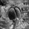
| 05/19/2004 05:23:17 AM |
knotby GinaRothfelsComment: Unusual black and white, would have prefered more detail in the highlights. There is too much contrast in this shot for my taste, meaning that shadow and highlight detail is lost. Very noisy. Ultimatedly not enough here to sustain my interest. |
| Photographer found comment helpful. |
| 05/17/2004 05:14:34 PM |
The Freshest Juiceby bruskiComment: Great use of this often used technique... here it seems quite fresh. I love the textures at the bottom of the frame. Nice sharpness. Nice idea to have a reflection at the bottom. Great silhouette at the top. Lovely colour and saturation. |
| Photographer found comment helpful. |
| 05/17/2004 05:10:09 PM |
Forgotten Benchby TooCoolComment: Bit of an overdose of sepia here... too much red or magenta. Good sepia effects are usually quite subtle. Compositionally there is so much texture here, it is hard to know what to focus on. Maybe colour would have been better. |
| Photographer found comment helpful. |
| 05/17/2004 05:08:01 PM |
|
| Photographer found comment helpful. |
| 05/17/2004 05:05:55 PM |
Reflection at Duskby dinnComment: Gorgeous... I'd have liked the sky colours a tad richer. I love how the lights in the reflection are made much longer. |
| Photographer found comment helpful. |
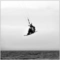
| 05/17/2004 05:03:52 PM |
On Any Windy Sundayby jimmythefishComment: Great shot... a little too much contrast for my taste here though. I'd like to see more detail in the figure. NeatImage in the sky would have helped with the noise levels, and you really need to clone out the white pixel dots in the sea. Love the shallow dof. |
| Photographer found comment helpful. |
Home -
Challenges -
Community -
League -
Photos -
Cameras -
Lenses -
Learn -
Help -
Terms of Use -
Privacy -
Top ^
DPChallenge, and website content and design, Copyright © 2001-2025 Challenging Technologies, LLC.
All digital photo copyrights belong to the photographers and may not be used without permission.
Current Server Time: 06/26/2025 06:46:17 AM EDT.