| Author | Thread |
Comments Made During the Challenge  |
|
|
05/19/2004 02:36:54 PM |
|
 Photographer found comment helpful. Photographer found comment helpful. |
|
|
05/19/2004 11:01:03 AM |
Challenge centered – 10
Creative – 6
Appeal (is it interesting?) – 6
In Focus/Clear - 10
score 8
|
|
| Photographer found comment helpful. |
|
|
05/19/2004 05:24:52 AM |
|
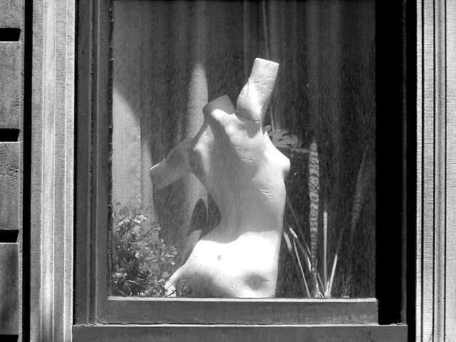
Interesting shot... unfortunately your subject doesn't quite stand out enough from the surroundings to draw my eye in. Burnt out highlights are unfortunate. Rest of the photo has some interesting textures, but this is part of the problem as they take attention away from the subject. |
|
| Photographer found comment helpful. |
|
|
05/19/2004 01:08:57 AM |
|
Mannequin seems overexposed a bit. Window frame shows lots of texture and details and so does the screen. |
|
| Photographer found comment helpful. |
|
|
05/18/2004 10:18:32 PM |
|
Nicely done. The BW really compliments the pic. My only problem is the figure seems to be almost overexposed, try shooting at a different time of day when the sun is not quite so straight down. |
|
| Photographer found comment helpful. |
|
|
05/18/2004 05:47:10 PM |
Nice use of b/w, excellent shadows. I may have cropped a little more from the sides as horizontal lines on the left seem to distract more than add any value to the picture.
I think you could have even cropped this with just the window frame (dark gray) and inward and we still would have picked up on the fact that the venus was through a window. Great Idea, very good picture. |
|
| Photographer found comment helpful. |
|
|
05/18/2004 11:01:33 AM |
|
I love the title. :) The shot's just okay, not enough contrast, feels a little washed-out. |
|
| Photographer found comment helpful. |
|
|
05/17/2004 09:28:15 PM |
|
The framing I think should have been tighter and more contrast on the sculpture. Nice idea. Shooting through windows is difficult. |
|
| Photographer found comment helpful. |
|
|
05/17/2004 02:16:46 PM |
|
no interesthere not dead center 3 |
|
Home -
Challenges -
Community -
League -
Photos -
Cameras -
Lenses -
Learn -
Help -
Terms of Use -
Privacy -
Top ^
DPChallenge, and website content and design, Copyright © 2001-2026 Challenging Technologies, LLC.
All digital photo copyrights belong to the photographers and may not be used without permission.
Current Server Time: 06/28/2026 03:33:13 PM EDT.